BentleySafe | Lead Design Researcher
Through usability testing and iterative redesign, we uncovered critical usability gaps in the BentleySafe app and reimagined its interface to better support users in high-stress scenarios. This end-to-end project strengthened my skills across research, analysis, and design, bringing clarity, calm, and confidence to campus safety.
Tools:
FigJam, Figma, Miro, Google Sheets, Figma Slides, Jira

Summary
Project goal
Evaluating the usability of the BentleySafe App would help improve its intuitiveness, relevance, and perceived value for students and faculty.
Key Objectives:
Understand how users interact with key safety features.
Explore how different user groups (students vs. faculty) perceive and utilize the app.
Identify usability pain points and barriers to effective use.
Gather actionable insights to inform a more inclusive, user-centered redesign.
SWOT Analysis
To get started, we conducted a quick collaborative SWOT analysis on FigJam. This helped us assess the app’s internal capabilities and external landscape, ensuring that our design decisions were both user-centered and context-aware.
Strengths
Weaknesses
Opportunities
Threats
Competitive Analysis
To uncover opportunities and set a high design bar, we analyzed three peer apps—Google Safety, bSafe, and the University of Oregon app. This helped us evaluate BentleySafe’s strengths and gaps in real-world context, especially around usability, accessibility, and emergency communication.

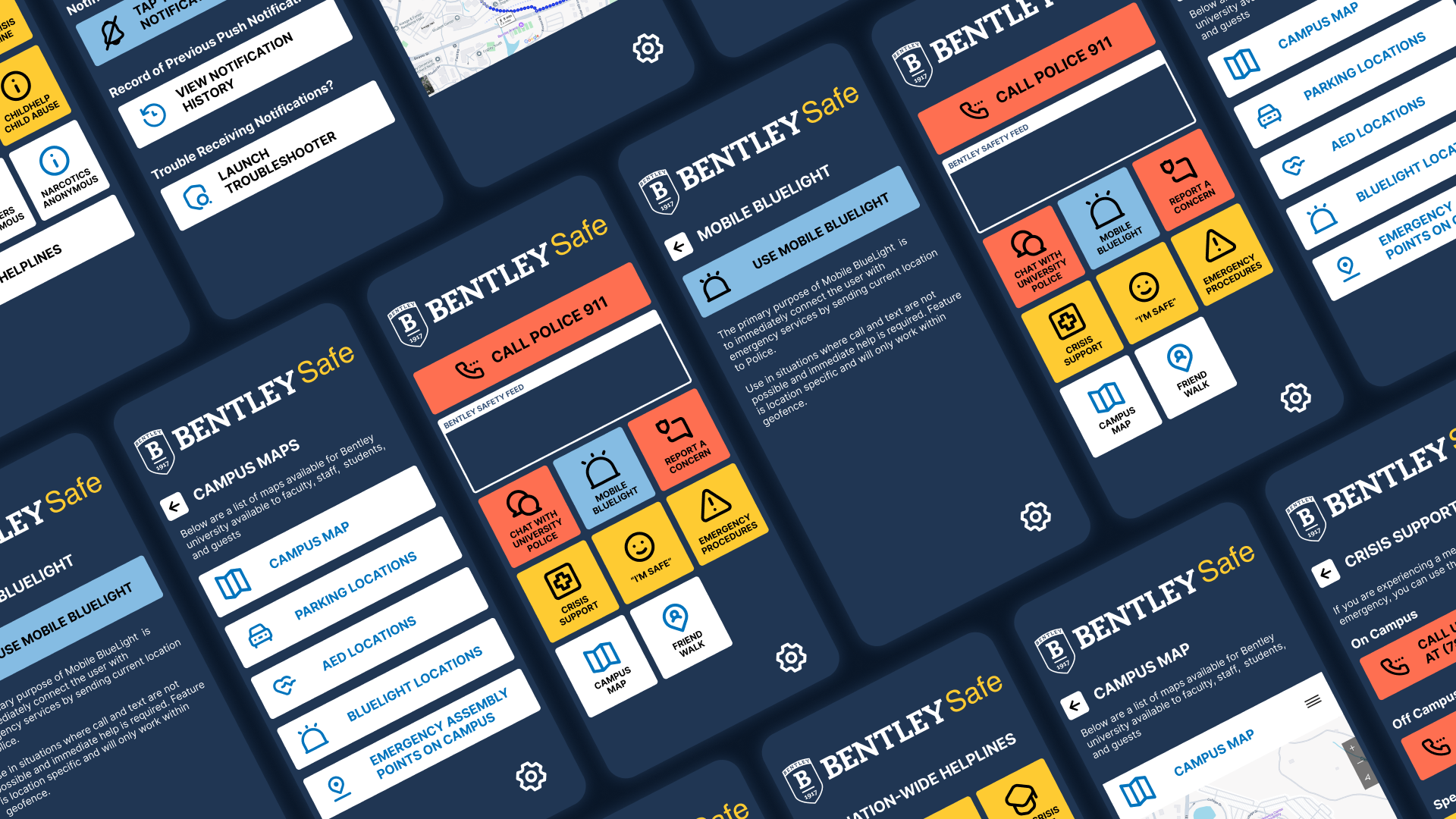
USABILITY TESTING
We ran usability tests to evaluate how well BentleySafe supports students during high-pressure situations, uncovering gaps in clarity, flow, and task completion speed. We defined 5 main tasks to test users:
Task 1
View campus map
Task 2
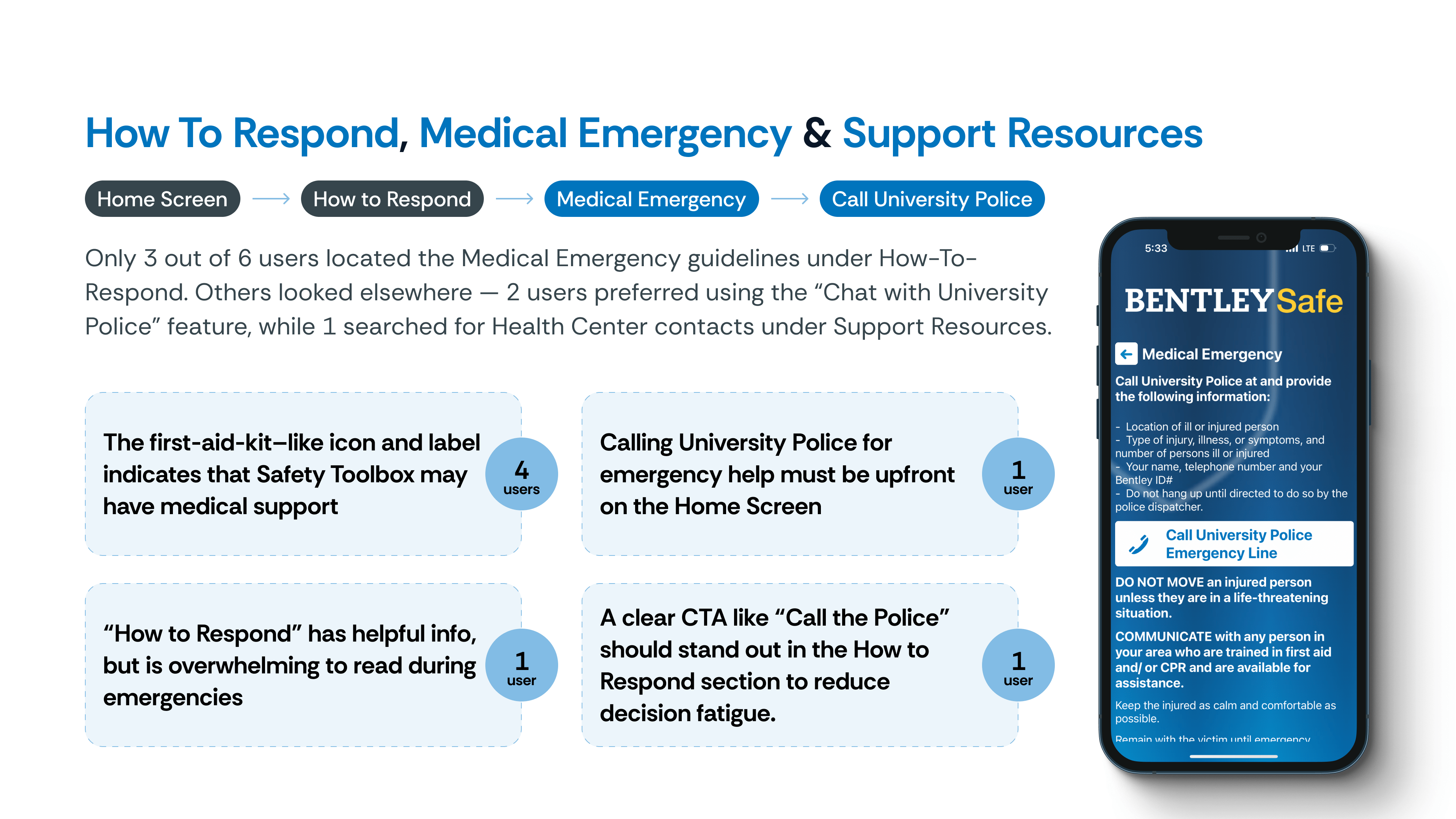
Get help for a medical emergency
Task 3
Let a contact know you’re okay in an emergency
Task 4
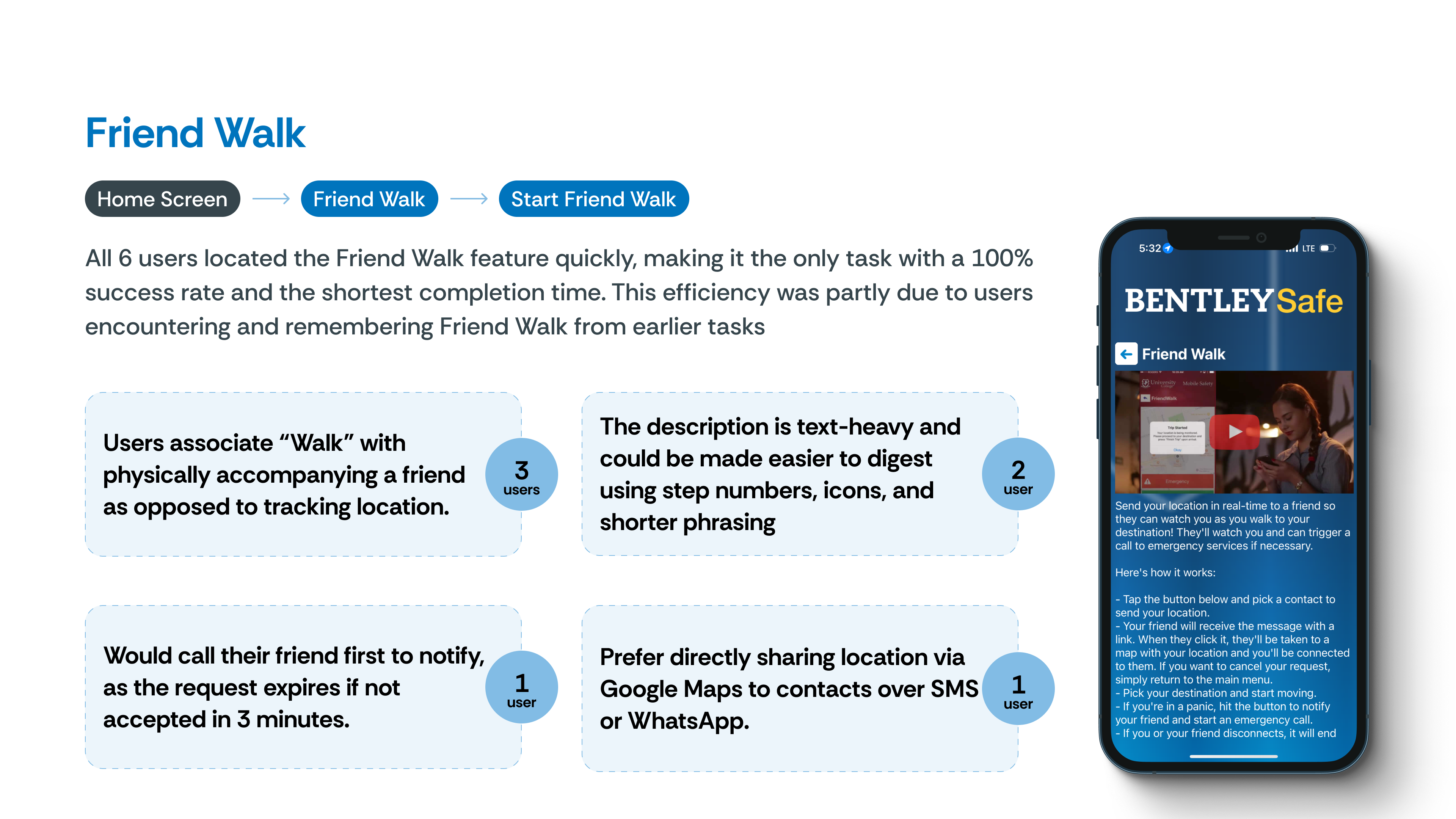
Ask a contact to track you as you walk
Task 5
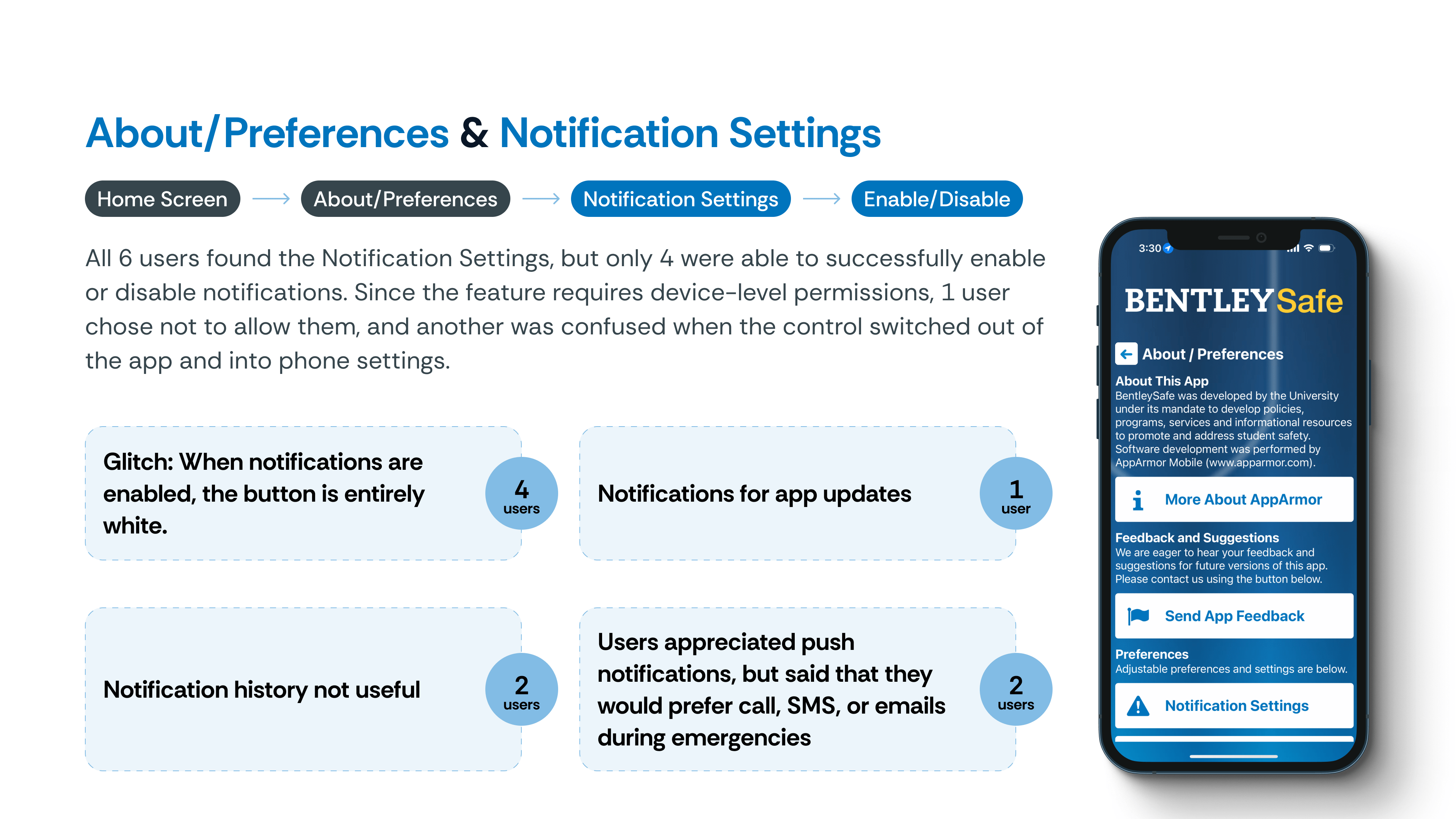
Modify notification preferences
What We Did:
Participant Profiles
We recruited 6 participants from the Bentley community through convenience sampling. While we achieved a balanced gender split (3 male, 3 female) and a mix of faculty (3), undergraduates (2), and graduate students (1), the sample skewed heavily toward international users (5 out of 6).
Given the short turnaround time for the project and the timing clashing with students' end-of-semester exams, this was the best that we could do; had we had more time, we would've tried to recruit more participants with an even distribution across demographics.

Data Synthesis and Analysis
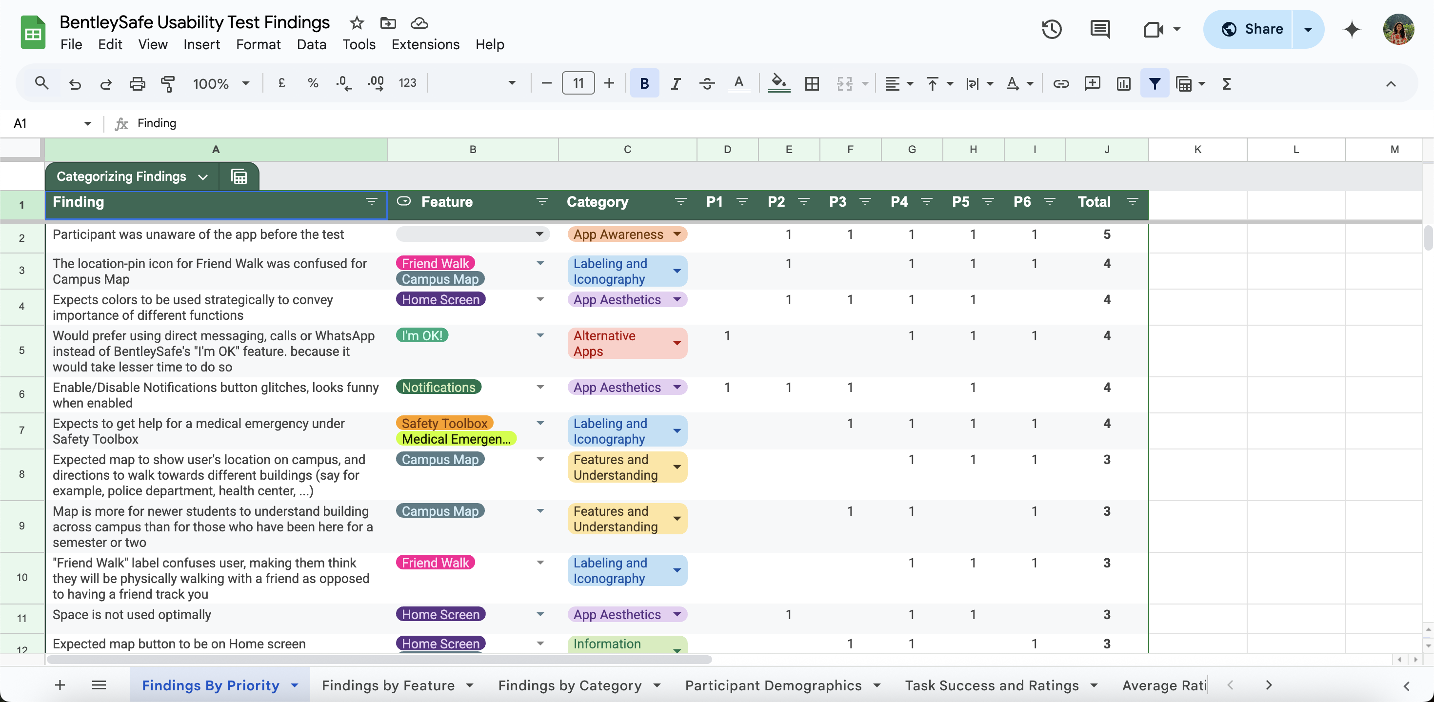
From raw feedback to clear direction using Miro and Google Sheets
After conducting usability testing, we collected observations, user quotes, and ratings in Miro and visualized patterns in Google Sheets. This helped us cluster issues, spot trends, and prioritize design changes that would make the greatest impact.
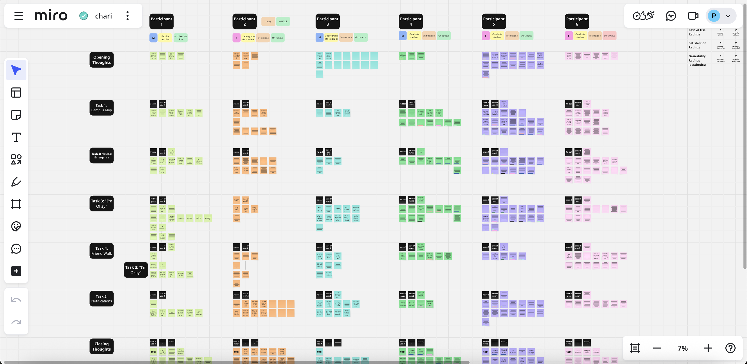
Miro
Google Sheets
Overall Test Ratings
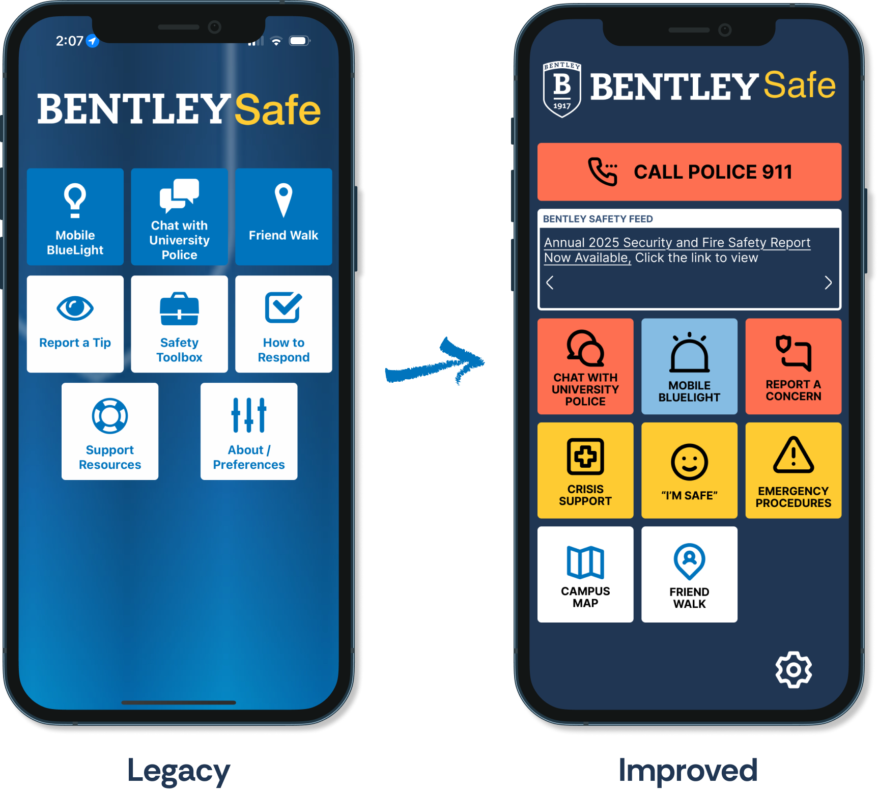
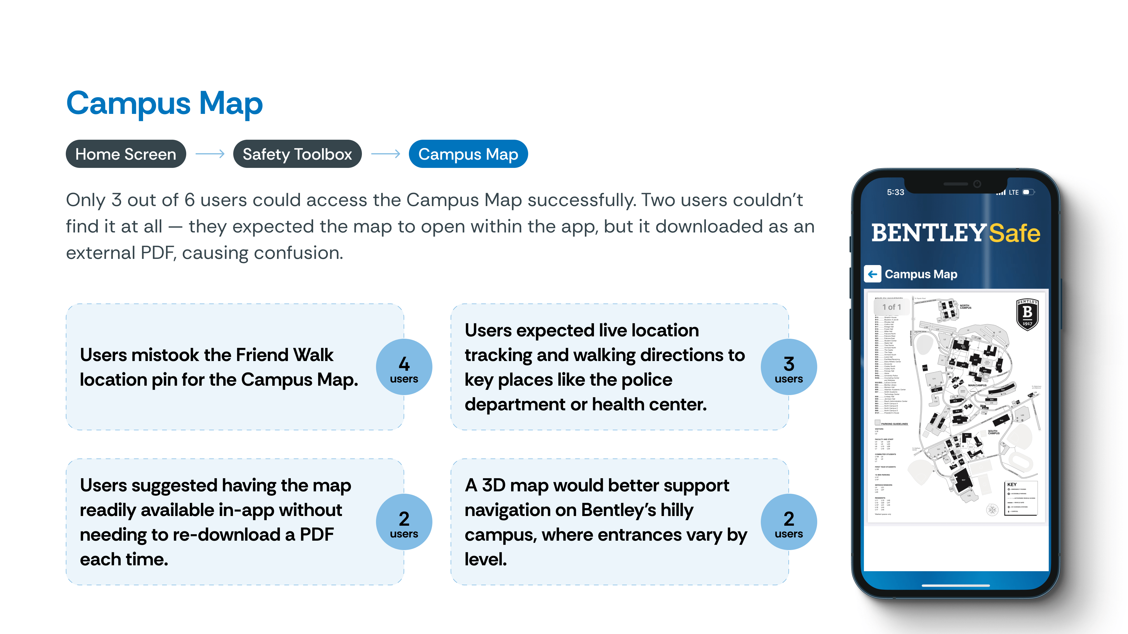
Users took the longest to locate the Campus Map, I’m Okay, and Medical Emergency Help features, largely because they were buried under buttons with unclear or unintuitive labels. In contrast, the Friend Walk and Notification Preferences were more easily found, thanks to stronger alignment between user mental models and the app’s feature placement.

Qualitative Insights
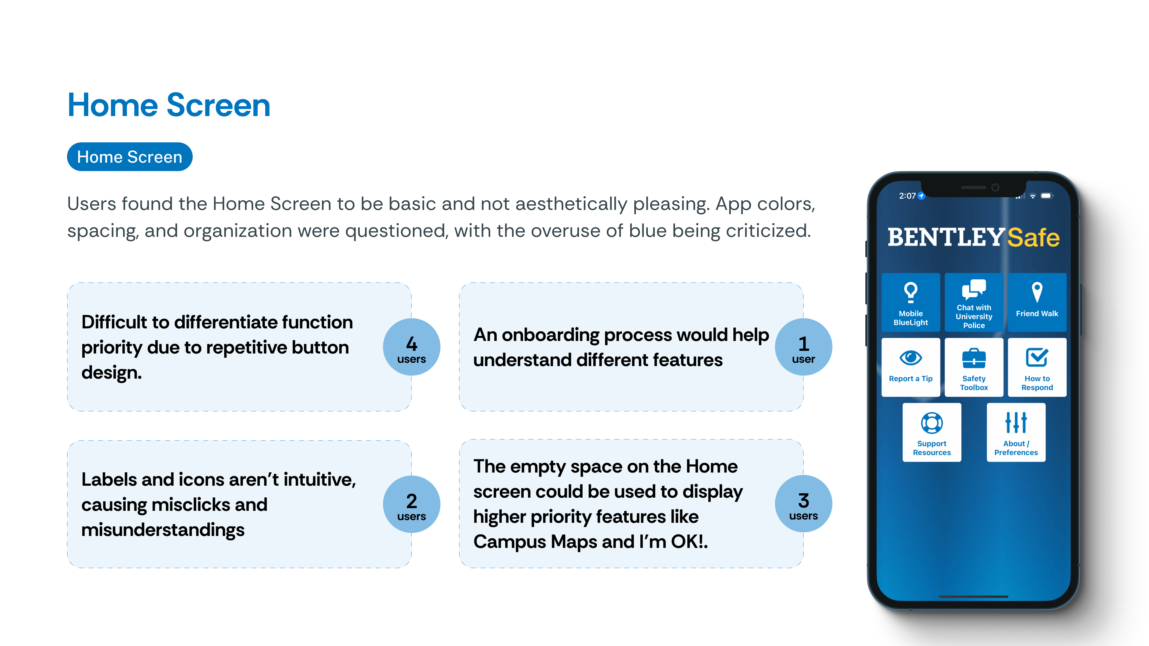
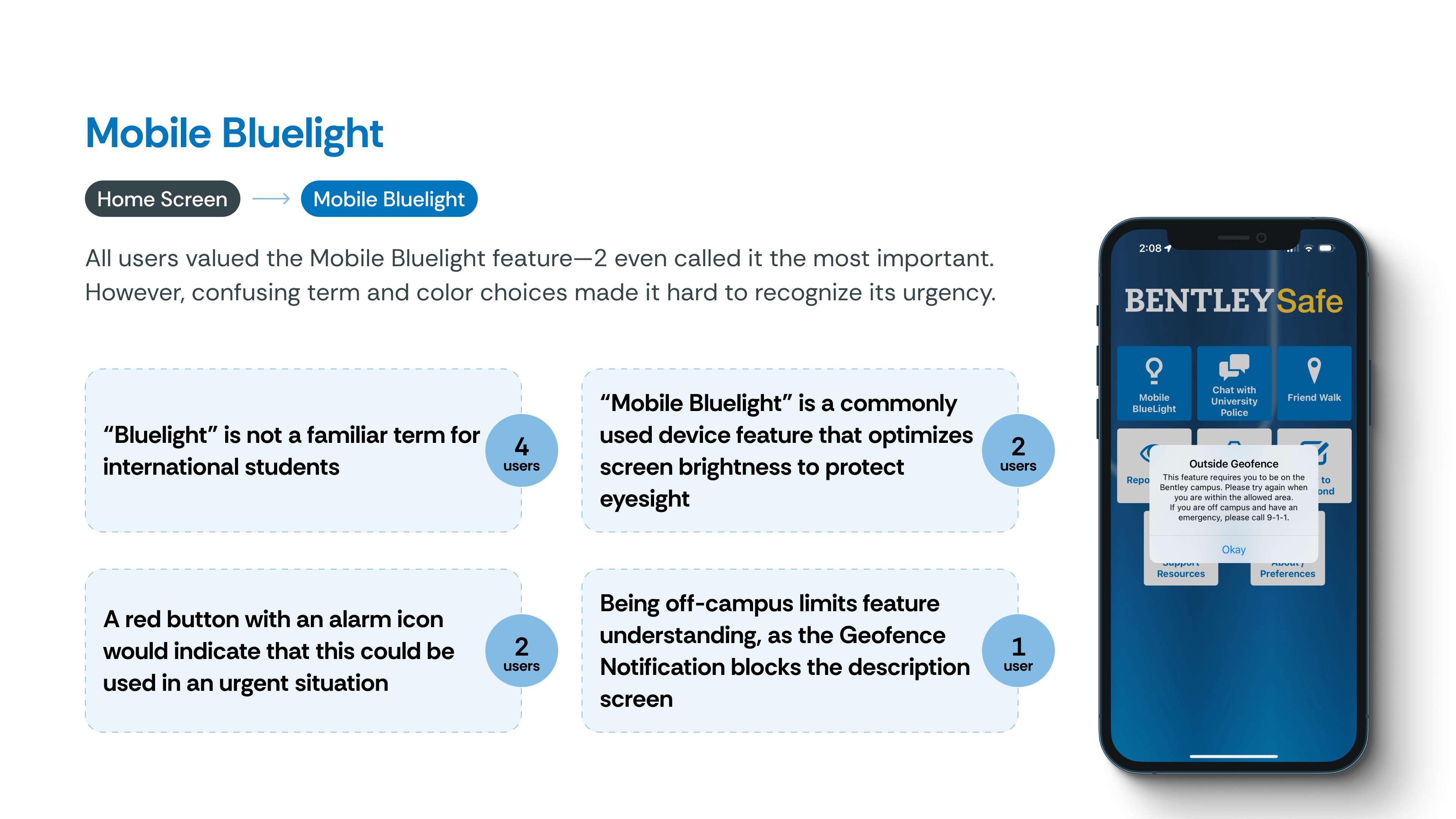
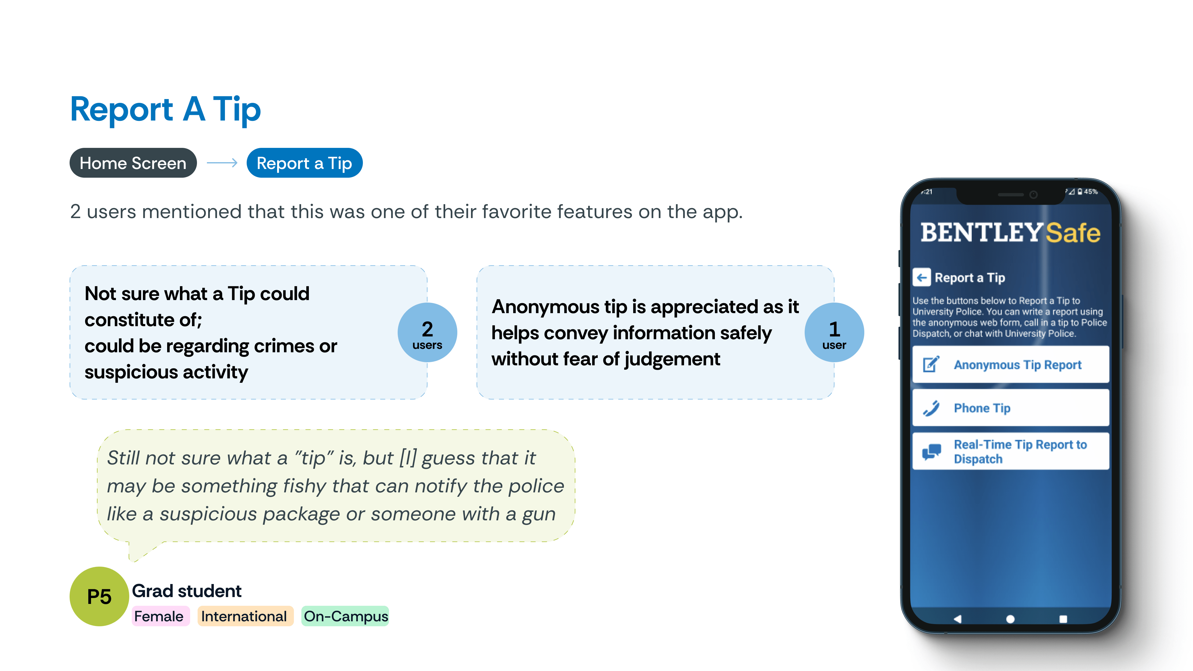
Insights are organized under categories for easier navigation. Click on each thumbnail to explore pain points, direct quotes, and the context that shaped our redesign decisions.


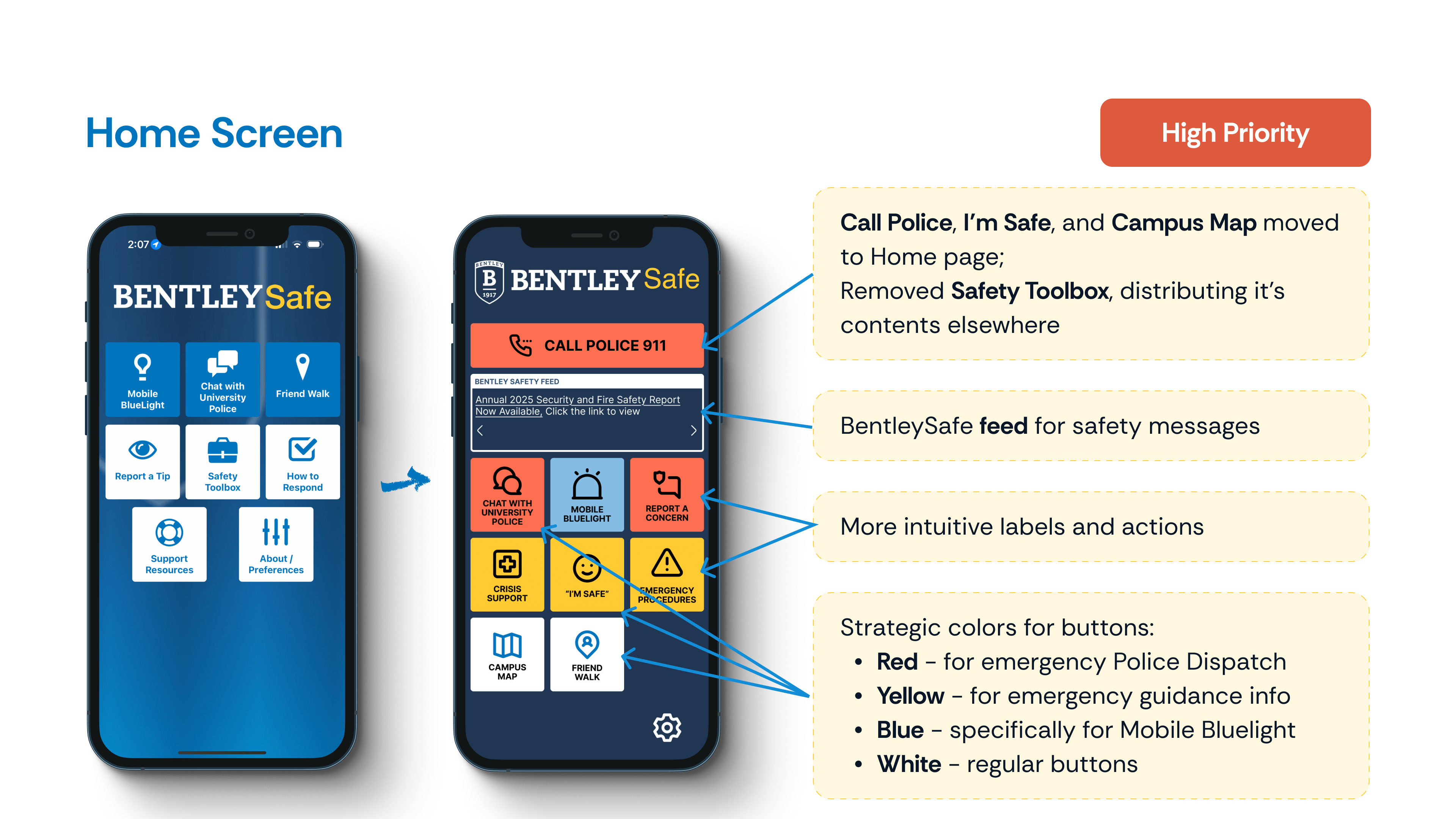
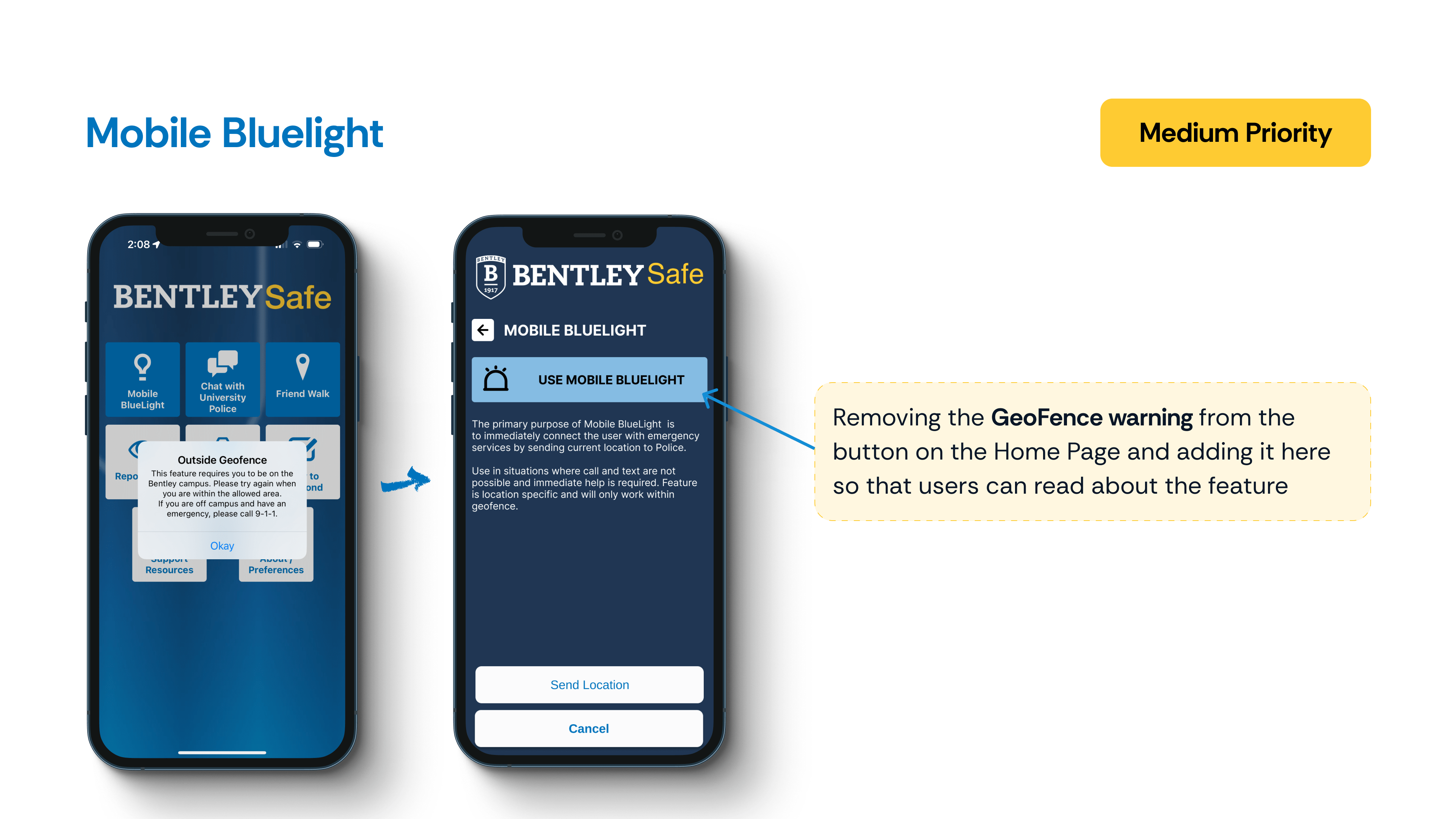
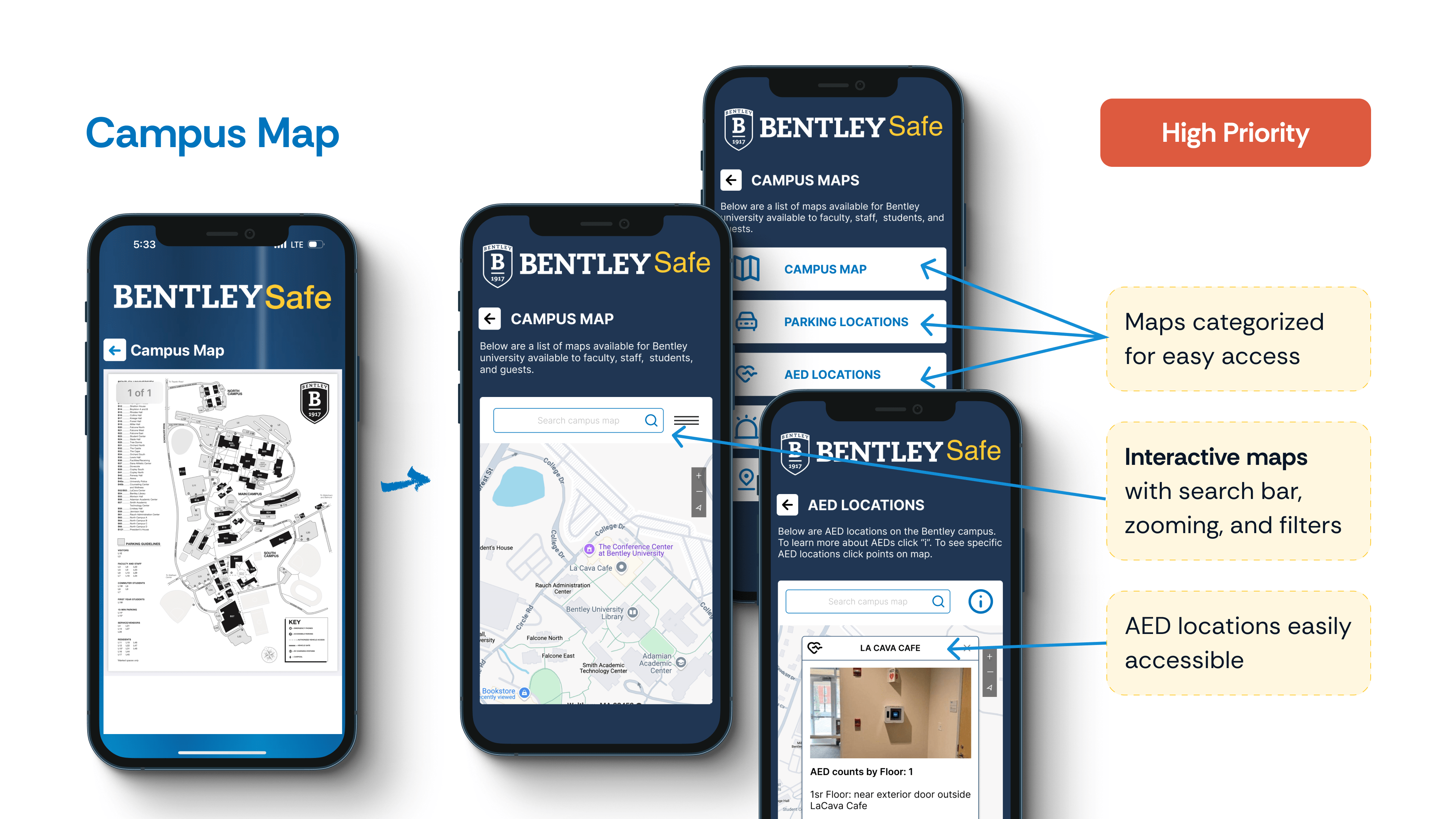
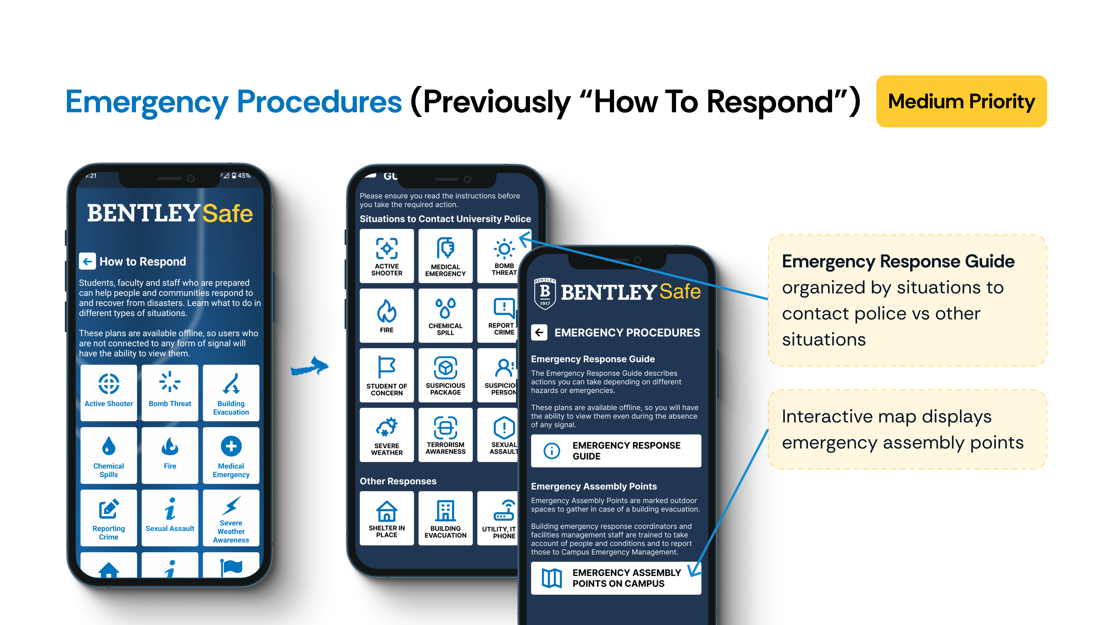
Redesigns
Each redesign directly reflects what users told us—and what they didn’t. Based on the insights above, we reimagined key flows to reduce cognitive load and improve access to high-priority features. Dive into each redesign by clicking on the thumbnail to see what changed, why it mattered, and how it solved the real user frustrations we uncovered.
Marketing Strategies
Through research, we realized that redesign alone wouldn’t drive engagement. Many students weren’t even aware of the BentleySafe app—let alone critical features like Bluelights or AEDs. To bridge this gap, we proposed strategic awareness efforts to get the app on students’ radars and make its vocabulary part of campus culture.
Orientation Integration
Educational Support
Empowering Internal Support
Celebrate and Communicate
Wrap Up
Our team concluded the project by presenting our findings and redesign recommendations to both the Bentley University Police Department and AppArmor, the third-party platform powering the app. Alongside the presentation, we delivered a comprehensive report documenting our research, usability testing, and redesign rationale to guide next steps in the app’s development.
WIN
Hands-on ownership across the product lifecycle
I led end-to-end—from user research and testing to prototyping, synthesis, and final presentation. I also drove the creation of the report and was the primary contributor through most phases, while using agile methods to keep us moving.
LEARNING
High-stakes design needs low-friction usability
In emergency contexts, even small friction—unclear labels, buried features—can mean big consequences. Simplicity, visibility, and user vocabulary familiarity are critical.
WISH
More time + broader participant base
Conducting usability testing at the semester’s end made it hard to recruit undergrad participants. As a result, most testers were international students, which may have unintentionally skewed perceptions of certain emergency terms like “Bluelight” or “AED.”
Eleanor Health | UX Designer
Created patient-centered solutions to improve engagement in addiction care for individuals with Alcohol/Substance Use Disorders, enhancing accessibility and reducing no-show rates through research, journey mapping, and prototyping.
Tools:
Figma, FigJam
Outline
Eleanor Health (EH) is a virtual-first outpatient addiction treatment program that provides online services for people in recovery from substance use disorder. They offer judgment-free support, affordable treatment and personalized care. Their approach integrates medical care, behavioral health support, and community resources to provide a comprehensive, compassionate, and stigma-free treatment experience.
EH faces challenges such as high patient dropout rates, ensuring first appointment attendance, and serving members with limited resources in a virtual-first model. Additionally, addressing co-occurring mental health disorders and overcoming stigma are ongoing hurdles.
Our goal was: how might we enhance engagement in addiction care to better support individuals and stakeholders involved in the process?
Figjam, Figma
February - May 2024
(This was a 4-person team project as a part of my Design Innovation course at Bentley)
Project Goals
Working as part of a team of four, this was an academic collaboration with Eleanor Health (EH), an addiction care center committed to supporting individuals affected by addiction in leading fulfilling lives. EH is dedicated to revolutionizing the quality, delivery, and accessibility of addiction treatment and mental health services. Our core focus was on exploring several key questions:
How might we reimagine the member journey and experience?
How might we innovate our business model?
How might we reduce the number of no-show patients?
How might we ensure members attend their first appointment?
How might we better serve members with limited access to resources, such as technology?
Secondary Research
We were not allowed to engage directly with patients. We were provided with valuable resources such as the Patient Experience Journey Map from Addiction Policy Forum (APF), which highlighted the detailed stages of the patient journey from the onset of symptoms through treatment and recovery. This resource offered firsthand patient quotes on both "bright spots" and "pain points," providing deep insights into the challenges faced by those seeking addiction treatment.
Key findings from the secondary research include:
The age of onset for Substance Use Disorders (SUDs) ranges from 5 to 19 years, with an average of 14 years (APF).
Young adults often perceive substance use as part of identity exploration, underestimating its harms (SAMHSA).
Certain groups, such as those with co-occurring mental or developmental disorders, are at higher risk for substance misuse (SAMHSA).
Protective programs in childhood, such as behavior modification and social-emotional skills training, have lasting effects into young adulthood (SAMHSA).
If a patient seeks help and does not receive it on the first attempt, they are highly likely to not reach out again. This is due to factors such as stigma, denial, fear of judgment, and the belief that their problem isn't serious enough—issues that are further exacerbated by a negative initial experience. (Probst et al., 2015)
Without strong initial therapeutic connections in virtual sessions, loneliness can set in, hindering recovery. (Hogg et al., 2023; Békés et al., 2021)
Business Model
The process began with mapping out Eleanor Health's current business model, where we identified crucial elements like partners, activities, customer segments, and revenue streams. This initial step gave us a clear framework to understand how the organization operates.
We then focused on stakeholders, with each team member creating individual stakeholder maps. By merging our insights and refining the map together, we created a comprehensive ecosystem map. This map illustrated the relationships and pathways between internal and external stakeholders, including insurance companies, treatment centers, pharmacies, EH staff, and the broader community. It was through this collaborative effort that we were able to pinpoint the most effective routes for designing our solutions.

Current User Journey
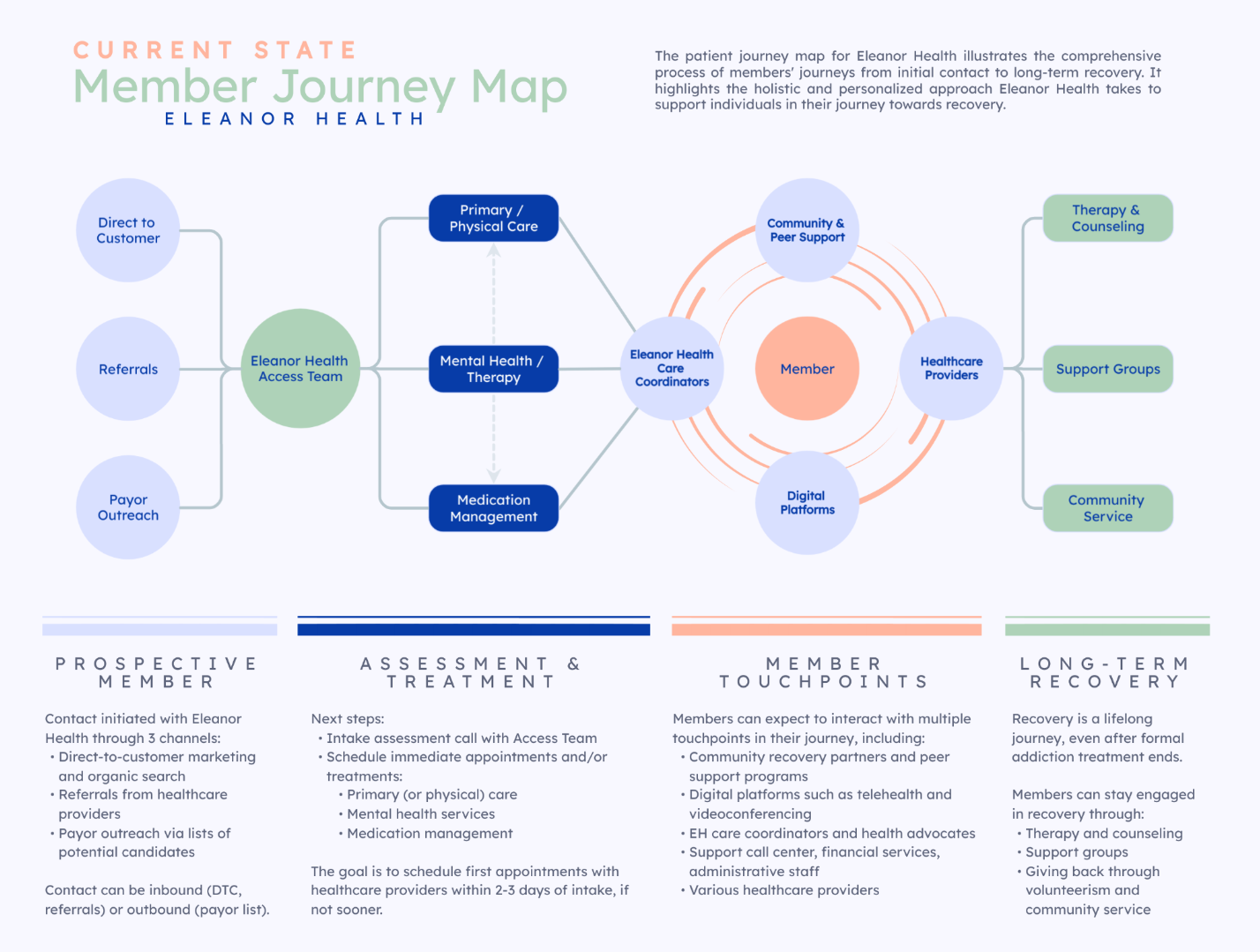
One of EH's biggest challenges was the fact that there was a limited number of staff in the Access Team creating a bottleneck in the path from a pre-member becoming a member.
Another was the high number of no-shows to the first appointment.
Ideation
Based on the member journey above, we used a brainstorming technique called Crazy 8s. Our team brainstormed 32 creative ideas based on problems from the perspectives of pre-members and members. We voted on the top 8 to focus on. These ideas were mapped on an impact-effort matrix to prioritize feasibility and potential impact based on Eleanor Health's resources.
The top 8 ideas were:

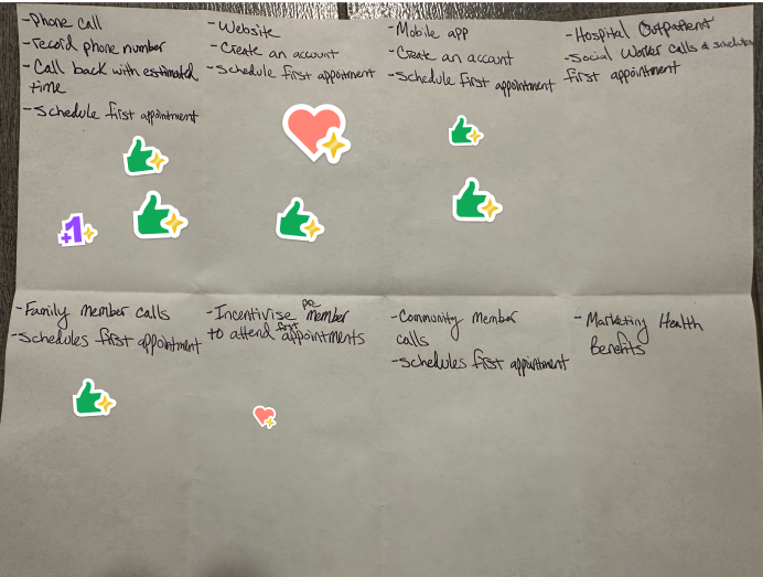


Option to reserve place in line
This idea involves creating a system where pre-members can opt to hold their place in a queue and receive a callback from EH staff, reducing wait times and frustration. It caters to both pre-members seeking initial appointments and current members scheduling follow-ups.
Rewards for Consistency
Members could earn rewards such as digital badges or physical tokens for attending appointments and completing treatment milestones. This gamification technique encourages engagement and consistency in treatment participation while fostering a sense of achievement.
Progress Charts w/ Status Updates
Personalized progress charts would visually display a member's recovery journey, tracking goals and milestones. These charts could be accessible digitally through a mobile app or physically as take-home materials, adding motivation and clarity to the recovery process.
Chat Therapy Options
Introducing a chat-based therapy platform allows members to have real-time or asynchronous communication with therapists, offering more flexible and accessible support options.
Frequent Contact and Collaboration
This idea involves more frequent check-ins with members via multiple channels like video calls, text messages, or emails. Collaborative participation in setting goals and action plans helps members feel more involved and supported throughout their journey.
Post-Session Debriefs
Following therapy sessions, members would share their thoughts on how confident they are about completing the next steps outlined for them. They could also anonymously share their opinions about their healthcare provider, and EH would ensure that any discomfort they feel is alleviated either by changing the provider or modifying treatment methods. This would ensure that members don't drop out of treatment mid-way.
Interactive Videos and Chatbots
Educational and interactive videos, coupled with chatbot support, could help pre-members understand EH’s services and members navigate their treatment plans. Chatbots would answer FAQs and guide users in a user-friendly, engaging manner.
Patient Account or Dashboard
A centralized dashboard would provide members access to their appointments, progress reports, treatment plans, and resources. This digital solution ensures convenience and helps members stay organized.

One of EH's biggest challenges was the fact that there was a limited number of staff in the Access Team creating a bottleneck in the path from a pre-member becoming a member.
Given our limited timeline, we as a team made a unanimous decision to explore idea 1: option to reserve place in line as we believed it would take the least amount of effort by EH and would create the highest impact, especially since EH's biggest issue was a small Access team, limiting the number of pre-members signing up for treatment.
It was the most feasible and viable option.
Future User journey
In the future-state journey, we envisioned two clear pathways for prospective members to establish contact with EH.
In this strategy, when a pre-member calls Eleanor Health (EH) but cannot be immediately connected, they are offered two options:
Once the pre-member connects with an EH staff member and schedules their first appointment, EH staff could follow up with a check-in call 24 hours before the appointment. This call would confirm attendance, address any questions, and reassure the pre-member, fostering a sense of comfort and preparedness for their upcoming session.
EH operates within specific boundaries regarding the pre-members it can accept. The pre-member must:
If a pre-member calls but finds the phone line busy, they could be directed to visit the EH website. There, they could check their eligibility and schedule their first appointment.
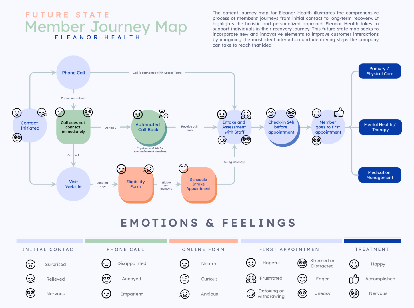
In this journey map, we zoomed in on the part of the pre-member's journey between initiating contact and going to their first appointment. For each section, we considered the kinds of emotions that a pre-member may experience - some of which were informed by EH based on past experiences. The goal was to seamlessly integrate a nervous or scared pre-member into the recovery program by building hope and making them eager to attend their first session.
Phone Strategies
EH faces challenges due to a limited number of staff managing phone calls, leading to unanswered calls when volumes are high. Research indicates that individuals with AUD or SUD who fail to receive help on their first attempt are less likely to try again due to stigma, denial, fear of judgment, or the perception that their condition is not serious enough. Each missed call represents a lost opportunity to connect a pre-member with necessary treatment. To address this, we proposed the below features.

When a pre-member calls EH and cannot connect immediately, they are offered the option to either stay on the line or request an automated callback. The system would collect the caller’s number, estimate a wait time, and assure them they will receive a call back when a staff member is available. This reduces frustration and ensures EH can follow up with every pre-member.
Business Value
Risks and Mitigation
Once the pre-member books their first appointment, EH staff would call them 24 hours before the session to confirm attendance, address any concerns, and set expectations. This proactive approach helps reduce no-shows and makes the pre-member feel more comfortable.
Business Value
Risks and Mitigation
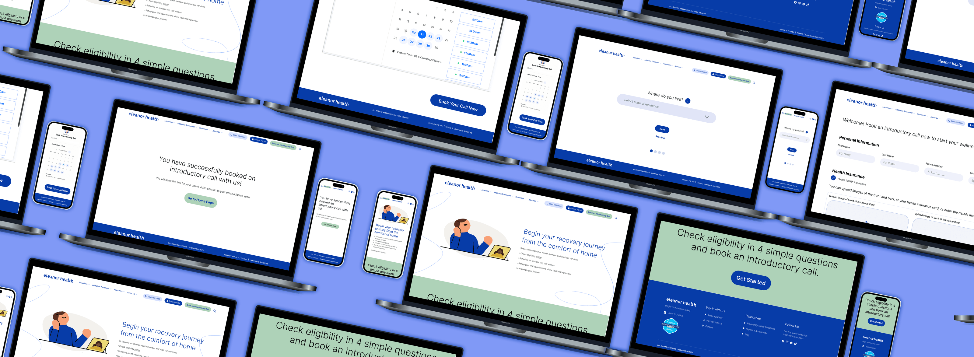
Website Strategies
To streamline intake and handle busy phone lines, we proposed a website-based eligibility and booking system, integrated into EH's existing website.

1. Website Enhancements
A prominent “Book an Introductory Call” button on EH’s menu bar leads pre-members to a responsive landing page. This page, designed to be accessible across devices, outlines the steps to becoming an EH member, with a clear call-to-action guiding users through the eligibility process.
2. Eligibility Check Form
A four-step form evaluates pre-members based on location, age, addiction type, and insurance coverage. Pre-members who don’t qualify are directed to a page acknowledging their circumstances and offering alternative resources and helplines, reflecting EH’s empathy and commitment to care.
3. For Eligible Pre-Members
Qualifying users proceed to the final form to:
Business Value
Risks and Mitigation
UI Design
The new landing page outlines the steps involved in starting care with EH and has a call-to-action section directing users to the form. The design incorporates EH's existing visual identity, including its colors, fonts, and graphics, to ensure consistency with the overall branding (we couldn't get licenses to use the website's fonts in the visuals, but recommended that EH use them if they implement our ideas).


The form is extremely easy to understand and complete with 4 filters. This would help filter out candidates that don’t qualify for their treatment, saving the time they would spend in calling and waiting to get in touch with EH.

Location

age

Type of addiction disorder

insurance provider
Users go through the filters one by one. If they don't qualify at any point during the form, they are immediately redirected to a page that informs them that EH cannot support them at this time. This page tries to deliver the message respectfully, providing actionable resources and helplines that could assist them instead.

respectful rejection
Individuals that are eligible for treatment can schedule their introductory call with EH by providing personal details and reserving their spot by booking a slot on Calendly.
This form essentially seeks to collect the information that would usually be discussed over phone calls during the pre-member intake phase. Internal research by EH has indicated that many pre-members express annoyance and frustration while spelling out their names, email addresses, and insurance details over phone calls. The booking form is a convenient way to overcome these pain points and reduce time on task.
To maintain safety in collecting health insurance information, EH should use HIPAA-compliant form builders such as Typeform or Jotform. To do the booking Calendly which is a convenient and commonly used option to book sessions. Once the pre-member books the call, they are notified that the call has been successfully booked, and they also get an email which contains a calendar invite and a link for the call.


Reflections
Presenting our designs and strategies to the stakeholders at Eleanor Health was an enriching experience.
Accessibility
Simplifying the pathways for pre-members to connect with EH.
Resource Allocation
Tailoring solutions to create a large impact with small measures.
Pre-Member Engagement
Solving pre-member pain points during intake process.
This project was exciting to work on because of the opportunity to work in addiction care, which is such a sensitive and important topic. I gained insights into the complexities of addiction and the nuances of Substance Use Disorders (SUDs), including their onset, challenges, recovery processes, and the terminology they prefer to be addressed by.
This project taught me the importance of designing with empathy, understanding complex stakeholder ecosystems, and creating solutions that balance organizational goals with user-centric values. Our work not only aimed to enhance the pre-member experience but also laid the groundwork for Eleanor Health to scale their impact, helping individuals on their path to recovery.
Boston Mayor's Youth Council | UX Researcher
Conducted 5 interviews, developed personas, and delivered insights to the MYC to improve community engagement strategies. Identified key factors that foster a sense of belonging and enhance participation within the community. Spearheaded study setup, stakeholder alignment, and participant recruitment.
Outline
The Mayor's Youth Council (MYC) unites high school students from all neighborhoods of Boston, serving as a diverse community that bridges various social divides. As representatives for the city, these youth design initiatives to improve the lives of Boston residents, especially fellow youth. The Office of Youth Engagement and Advancement (OYEA) aims to support MYC’s community cohesion and retention.
As an individual researcher, my purpose was to explore how to: Strengthen connections within a community.
March - April 2024
(as a part of my Field Methods course at Bentley)
Figjam, Figma
Stakeholder Collab
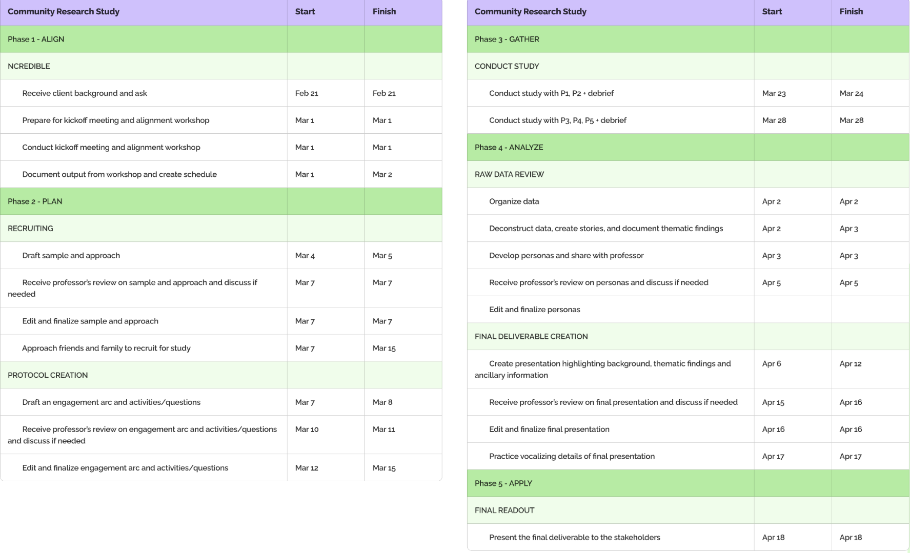
To start, I immersed myself in conversations with stakeholders, uncovering their aspirations for the study. They wanted to deeply understand what defines a community and the essence of belonging. Together, we framed thoughtful research questions, balancing their curiosity with the project’s tight one-month timeline. We adopted a discovery-driven approach—blending inspiration to understand people and introspection to uncover meaningful objectives.

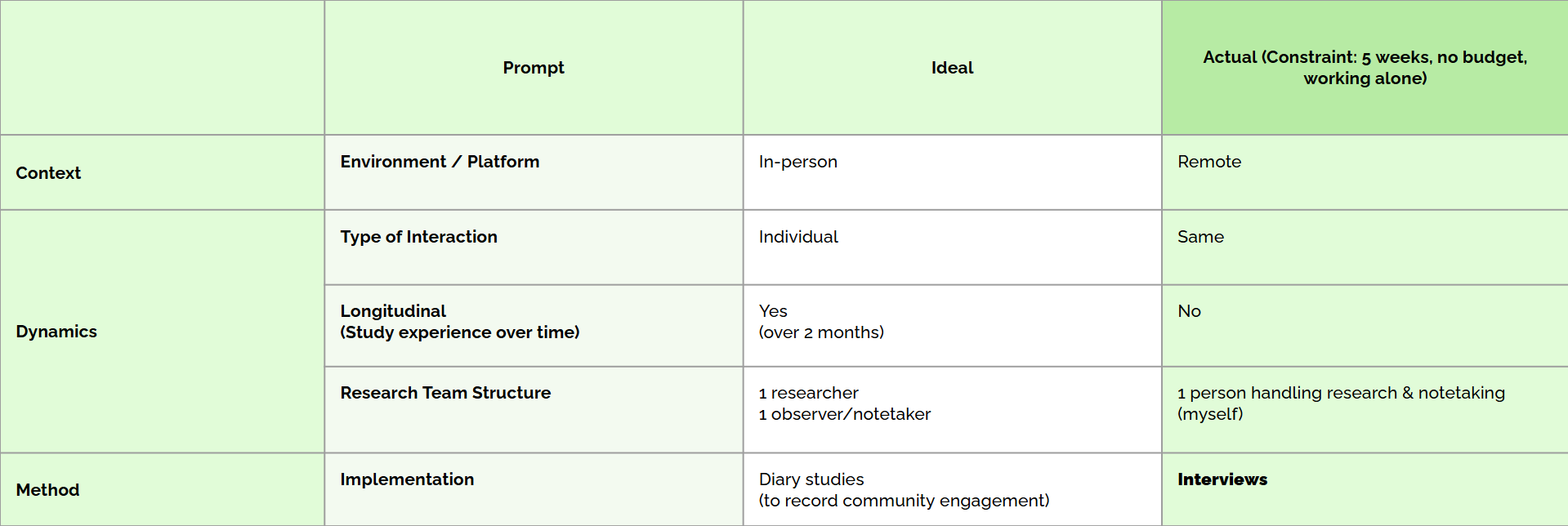
Research Design & Sampling
Given the constraints of a shortened timeline of a month and relying on friends-and-family recruitment, I had to settle for a constrained sample rather than my ideal expectation.
I focused on participants who had joined at least one community in the past 5 years, contributed to it weekly, and could share at least one meaningful story about their contribution to the community. This approach would bring valuable, albeit narrower, insights.
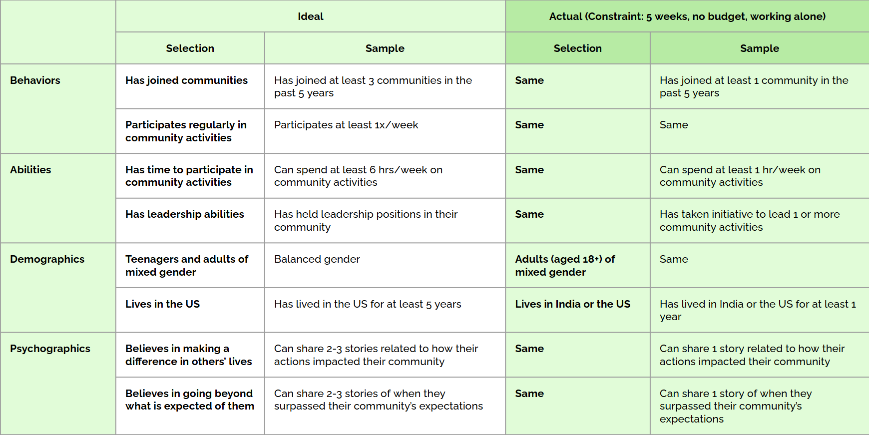
Approach
Ideally, I would conduct a two-month longitudinal diary study with in-person interviews supported by a dedicated note-taker. But with the reality of a one-month timeline and working solo, I pivoted to remote, one-on-one interviews, wearing the dual hats of moderator and note-taker.
While this approach worked, it came with trade-offs—I missed the subtleties of in-person interactions and the richness of longitudinal data. To ensure depth, I revisited interview recordings, making detailed notes to mitigate any loss in nuance.
Interview Protocol
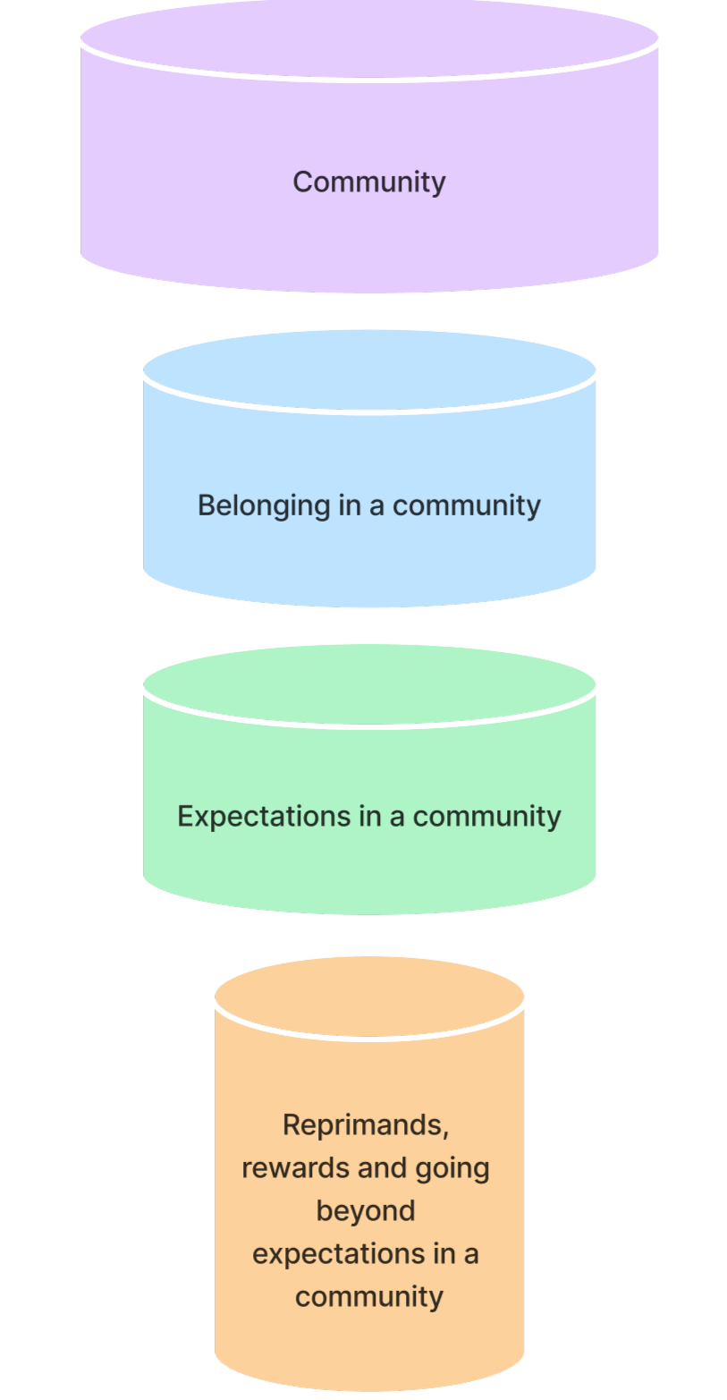
Designing the interview protocol was a challenge that took through multiple iterations. Starting with the stakeholders’ broad questions, I organized them into four thematic buckets: community, belonging in a community, expectations in a community, and roles of reprimands and rewards in going beyond expectations. This structure guided the conversation naturally, moving from broad ideas to specific insights. I carefully refined the questions to avoid bias while ensuring we addressed every stakeholder query within the tight 45-minute limit. To make the process engaging, I added activities that balanced empathy and fun.
A pilot session validated the protocol, giving me the confidence to proceed with a clear, comprehensive guide.
ScHedule & budget
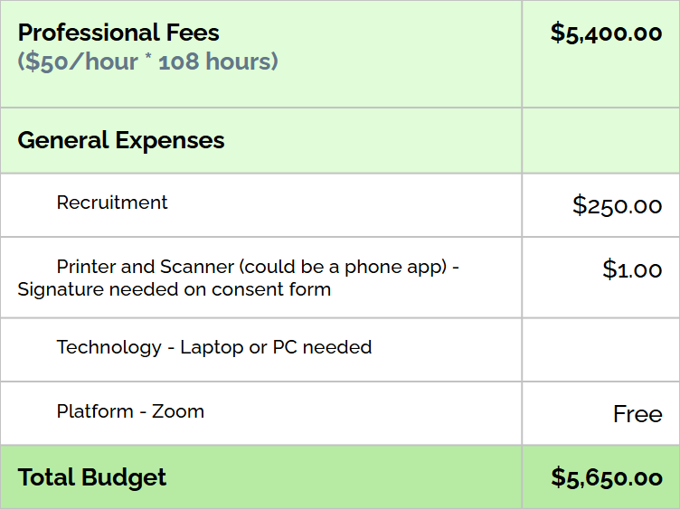
I created a schedule and a budget for interviews, assuming the role of an entry-level UX researcher earning $56/hour. Though academic, this exercise helped with planning and prioritization, underscoring the importance of time-management and resource allocation in real-world research.
Interview Execution
Participants were recruited through friends and family. To ensure transparency, I began each interview with a consent form, securing permission to record for accurate data capture.
Balancing roles as moderator and note-taker simultaneously proved a little challenging — I stayed present in the conversation while simultaneously making notes of key moments. Post-interview, I revisited transcripts and recordings, piecing together insights. This iterative process deepened my understanding of the participants’ stories, setting the foundation for meaningful analysis.
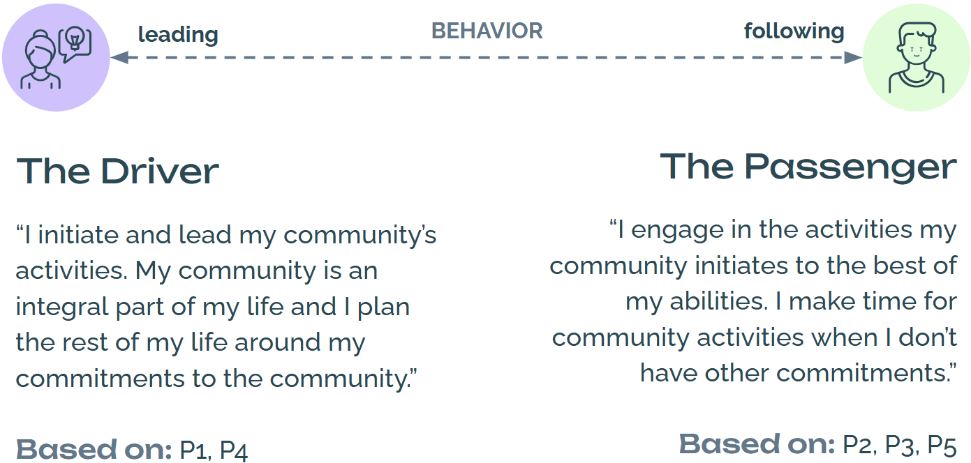
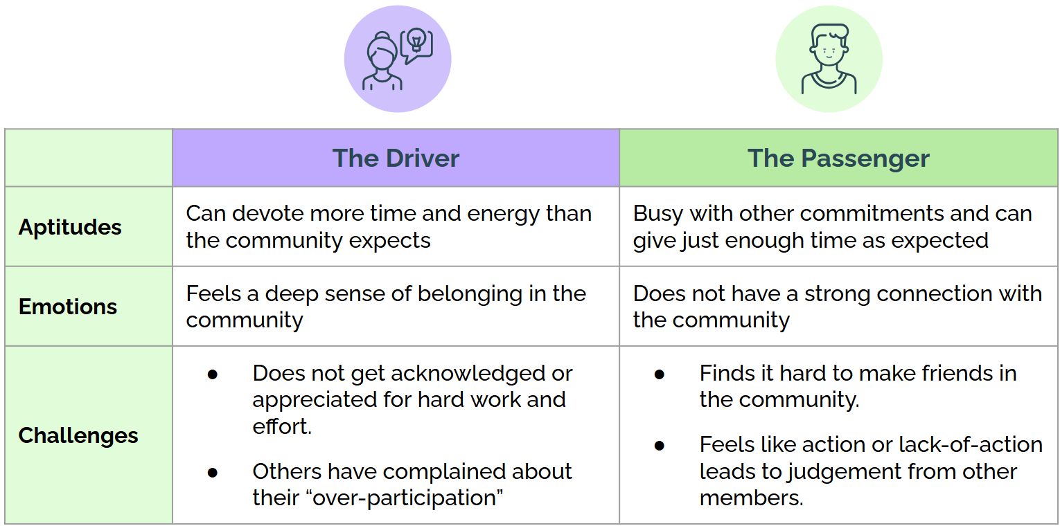
Data Synthesis & Personas
Patterns began to emerge, revealing two distinct personas on a spectrum of community involvement behavior - The Driver, a proactive leader and The Passenger, the engaged yet reserved participant.
Through these personas, I captured the emotional and behavioral dynamics of community members, providing actionable insights for stakeholders to address varied engagement levels.
Key Findings

Finding 1
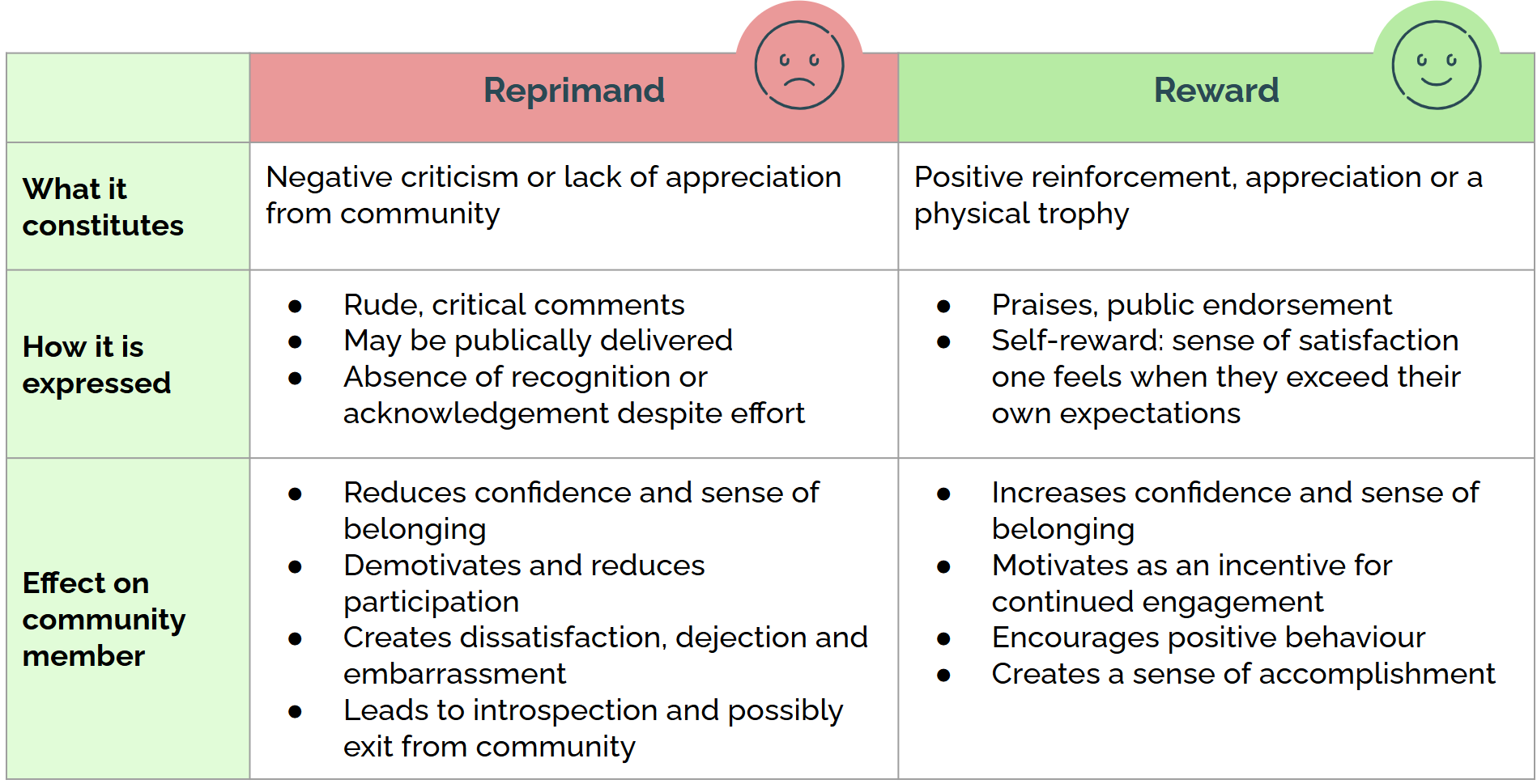
Communities form around shared goals, motivating individuals to collaborate, uphold shared values, and evolve through active participation, recognition, and positive communication.
Finding 2
Breakdowns may occur due to unmet expectations, disengagement, and negative experiences.


Constructive criticism delivered through the Sandwich method (which involves sandwiching negative feedback within layers of positive feedback or praise) is better appreciated than outright reprimands.
Wrap Up
Wrapping up the research, I presented my findings to the stakeholders, mapping insights back to their initial questions. They resonated deeply with the personas, The Driver and The Passenger. One insight stood out—the concept of self-reward was appreciated, prompting stakeholders to consider how they could inspire community members to go beyond expectations while feeling personally fulfilled.
Since this was an academic sponsor project, the stakeholders considered findings from all the students, informing them of ways they could implement changes within their community to strengthen connections.
Bentley University | Foundations in Human Factors (HF 700)
5 detailed case studies explore human factors principles through literature and design reviews, analyzing cognitive processes, perception, and decision-making.
They examine their impact on user experience and interface design across various applications.

Attention is guided by stimulus strength and sensory interaction, while sensation is shaped by stimuli, perception systems, and environmental factors. Perception occurs in two stages: bottom-up (sensory) processing, based on external input, and top-down (cognitive) processing, influenced by prior knowledge. Since sensory principles are universal, designers can leverage them to create more accessible products. This paper focuses on visual perception in the design of an electric wheelchair controller.

The early perceptual system detects patterns through shared visual qualities, with pre-attentive processing enabling rapid pattern recognition within 250 milliseconds. This ability, shaped by evolution, is crucial for interpreting visual cues and making quick decisions. Understanding these processes helps designers create clear visual hierarchies for accessible and efficient interfaces. This paper focuses on pre-attentive processing and a design review of an Air Quality Index website dashboard.

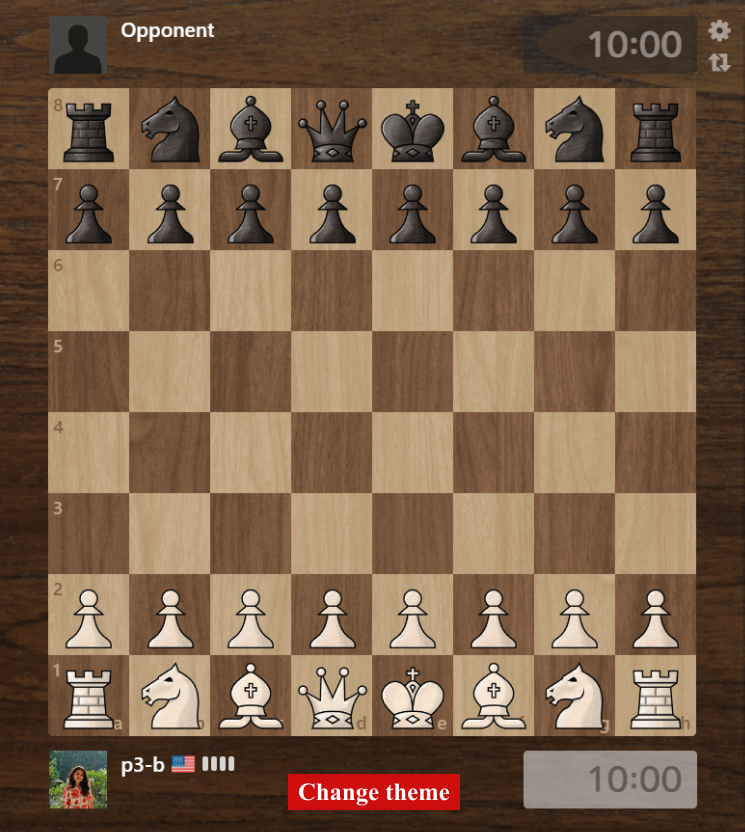
Humans are anticipatory systems, using predictive models to interpret sensory data through both bottom-up and top-down processing. The brain seamlessly integrates new information with prior knowledge, shaping perception in dynamic environments. This paper examines long-term memory, the influence of prior knowledge on perception, and the cognitive differences between novices and experts, followed by a design review of Chess.com.
Metacognition, or awareness of one’s cognitive processes, helps prioritize attention, assess knowledge, and adjust strategies for decision-making. It influences engagement and performance, creating a feedback loop that sustains focus. Designers can apply these principles to enhance engagement and decision-making in products. This paper describes the various stages of metacognition and its role in decision-making, followed by a design review of an airport assistant mobile application.
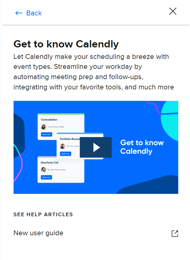
Working memory (WM) temporarily stores and manipulates information for cognitive tasks like problem-solving and decision-making. It interacts with long-term memory but has limited capacity, influencing attention and task performance. When demands exceed WM capacity, cognitive load increases, affecting efficiency. Understanding WM limitations helps UX designers optimize interfaces and reduce cognitive strain. This paper explores WM, cognitive load, and its influencing factors, followed by a design review of the Calendly appointment booking service.
Global Service Jam 2023
Promoting responsible riding and rewarding good behavior for office-goers.
Overview
The Safe Journey app is a revolutionary solution aimed at enhancing road safety for two-wheeler riders in the city of Bengaluru, particularly office goers working in multinational companies. It brings together motor insurance companies, selected MNCs, and government traffic control to create a collaborative ecosystem focused on rider safety.
The core idea behind the Safe Journey app is to incentivize safe riding practices through the intersection of technology, incentivization, and existing government interventions.
The idea was devised when I participated in the Global Service Jam - 2023 as a member of a multi-disciplinary team of 7. I continued to design the concept app individually after the Jam.
Discovery, Problem Definition, Ideation and Roleplaying (during the Jam).
Sole UI Designer
48 hours from discovery to roleplay (during the Jam)
2 weeks to complete the sitemap, user flows, wireframing and UI design
Figjam, Figma, white board, markers, sticky notes
Opportunity
In today's fast-paced world, where two-wheelers are a popular mode of transportation for office goers, ensuring road safety has become a pressing concern. Two-wheeler riders often face a higher risk of accidents due to various factors such as traffic congestion, non-compliance with traffic rules, and lack of awareness about road safety measures. Traditional enforcement methods alone may not be sufficient to motivate riders to consistently follow road safety rules.
Thus, there is a need for an application that enhances awareness about road safety and strives to make the daily commute safer, more enjoyable, and ultimately save lives on the roads.
Existing Measures
The traffic police department in Bengaluru has adopted a unique method to deter traffic violators. Dummies are dressed as traffic cops in the Bengaluru traffic police uniform, and are being placed at important junctions, hoping that violators will adhere to traffic rules. The idea is to increase the compliance and not scare anybody. The traffic police swap mannequins with actual police to keep commuters from violating traffic rules.
More than 1,100 CCTVs have been installed in Bengaluru to monitor traffic, at junctions and on certain minor roads and are monitored round the clock. Adaptive signals, which consider traffic patterns from their video feed to determine signal timings, are being used at 35 junctions. Automatic red light violation detectors (RLVD) are being used at 10 junctions, which capture the license plates of the vehicles. Speed guns are used on some main roads to measure and record speeds of vehicles, and detect over-speeding.
The National Highways Authority of India (NHAI) has equipped toll plazas with FASTag scanners to enable electronic toll collection. So, there is no need for cash to make payments at toll plazas. Instead, the FASTag scanner at a toll booth automatically detects the tag on a vehicle and deducts the required toll tax. The scanners use RFID Technology to scan the FASTag on the windscreen of a vehicle passing through the toll gate.
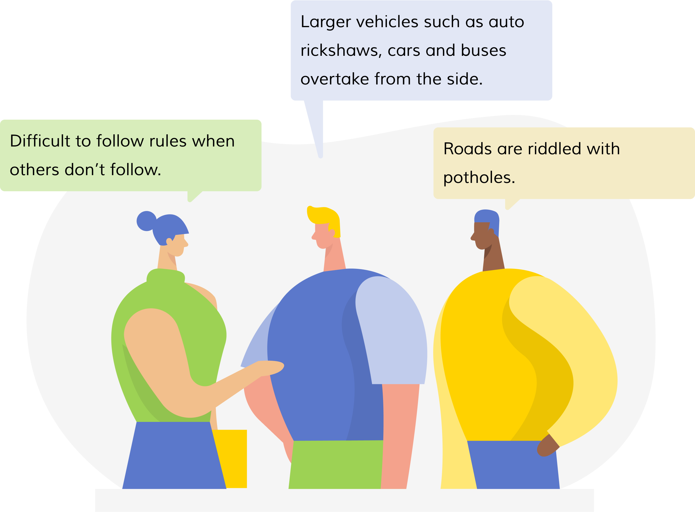
Key Research Takeaways
Through field interviews and secondary research, we could gather that riders are at danger from not only social traffic behavior and infrastructure issues, but also from negative habits of their own.The most common misdemeanors found were helmet-related issues, with excuses such as:
Other violations included using the pedestrian route to escape traffic and a general recklessness in order to save time.
Service Objective
The primary objectives of the service should be to:
Through rapid ideation and affinity diagrams, we, as a team, landed on a solution for a service that ensured a secure and protected commuting experience; we chose the name Safe Journey as it succinctly captured the purpose of our service.
Approach
'Safe Journey' is a systemic intervention service provided through the collaboration of motor insurance companies, selected MNCs and the Government Traffic Control to ensure 2-wheeler rider safety. The service emerges from the intersection of incentivization, technology and the pre-existing government intervention of Traffic Police Mannequins, powered through the Safe Journey app and IoT tracking mechanism.
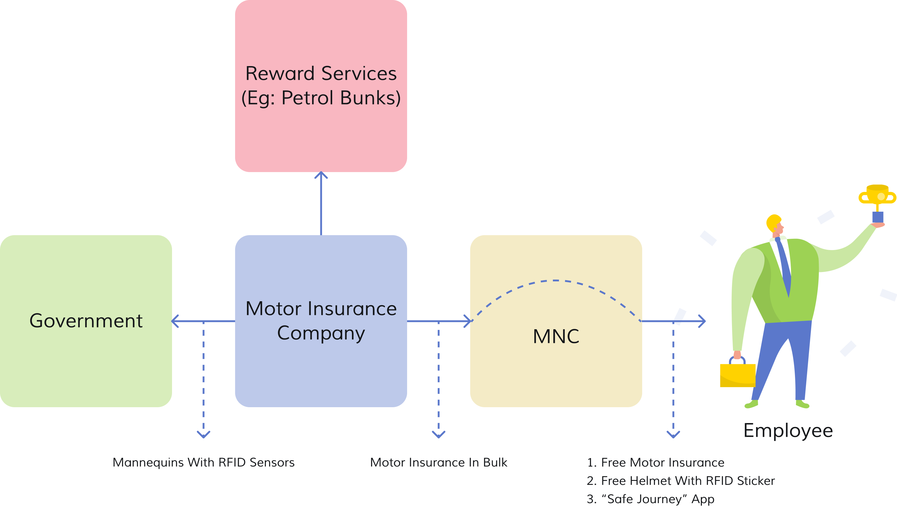
The service operates on a simple yet powerful concept. Mannequins strategically placed at major junctions and signals are equipped with RFID sensors (similar to FASTag scanners), which interact with unique RFID stickers affixed to riders' helmets to create a seamless tracking mechanism. The app gathers data from these interactions, monitoring crucial aspects such as adherence to traffic rules and helmet usage.
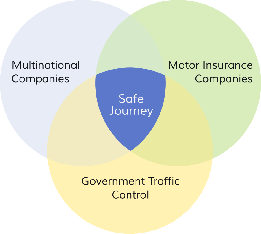
Motor insurance companies, selected MNCs, and government traffic control join forces to create a cohesive ecosystem focused on road safety.
Leveraging RFID sensors, GPS tracking, and the power of mobile applications, the app provides real-time notifications and data tracking capabilities.
The app rewards riders for their safe riding behaviors, encouraging positive habits and reinforcing responsible practices.
Building upon the traffic police mannequin initiative, the app integrates RFID sensors with mannequins placed at strategic locations to monitor rider behavior.
Proposed Implementation
Improvement in road-safety awareness and implementation, ease in catching defaulters, reduced strain on traffic police and positive public perception. Also enables to implement data-driven policies for accident prevention and traffic management.
Increase in number of customers through participation of large MNCs, a good marketing ploy to gain customers outside of office-goers, higher customer loyalty and scope for development of better business strategies based on data insights from the app.
Rise in employee safety, enhanced Corporate Social Responsibility (CSR), improved employee engagement and retention, and a positive brand image.
Customer Journey
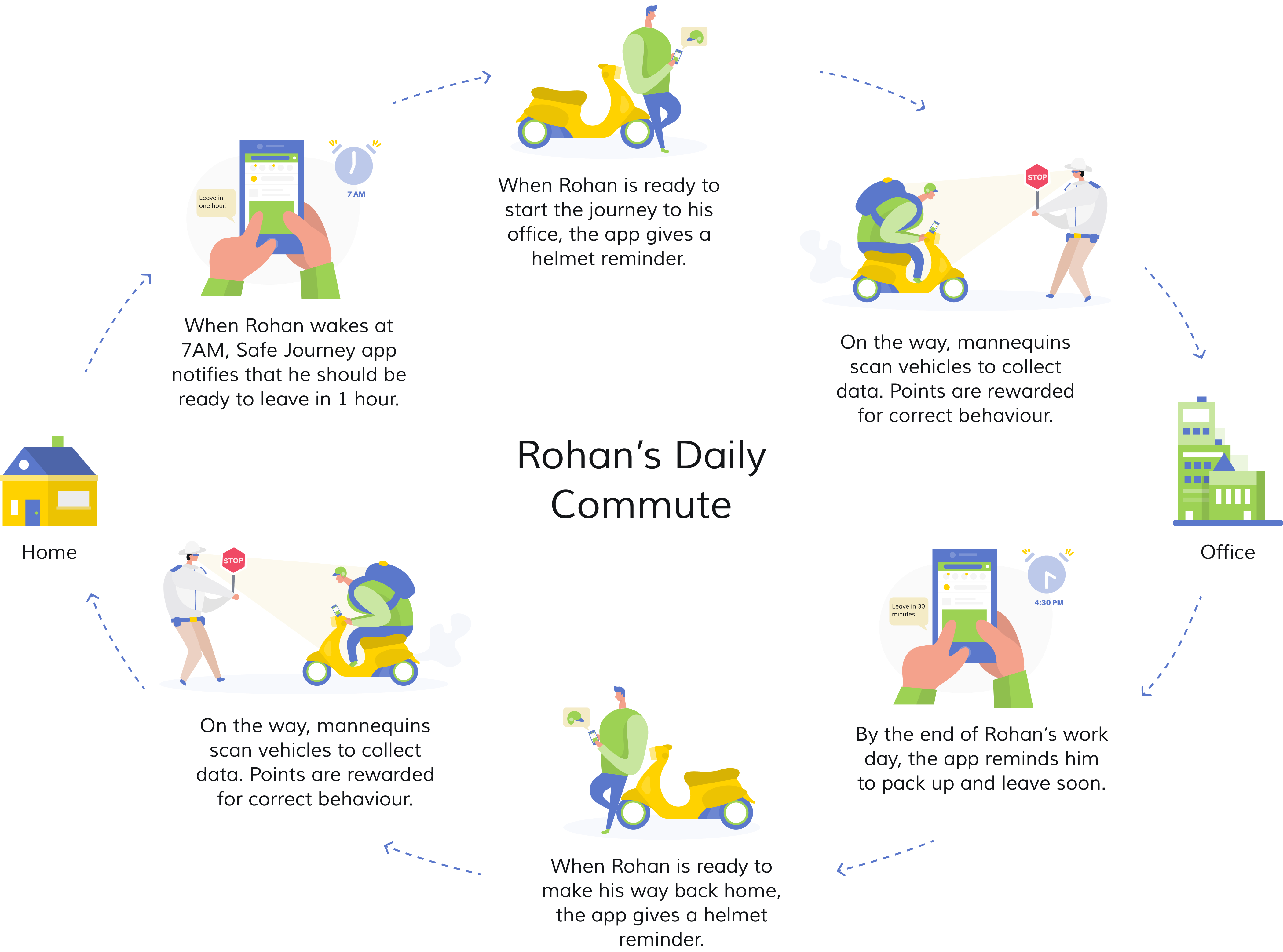
To map the customer journey, we have considered a persona called Rohan, who is a representative of the user type we are designing for - employees of MNCs who commute to office by a two-wheeler. Rohan is a 28-year old Bengaluru-based associate designer, who works at Infosys, an MNC. He has been riding for the past 10 years and recently purchased a new bike. He travels an overall distance of 20 km to and from office.
During the Jam, we presented the entire journey in the form of a role play during prototyping, the final stage of the event. The remainder of the case study consists of the concept UI design that I worked on solo.
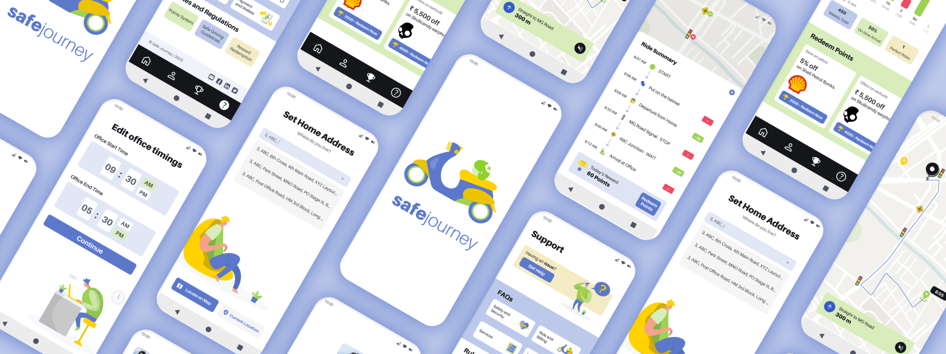
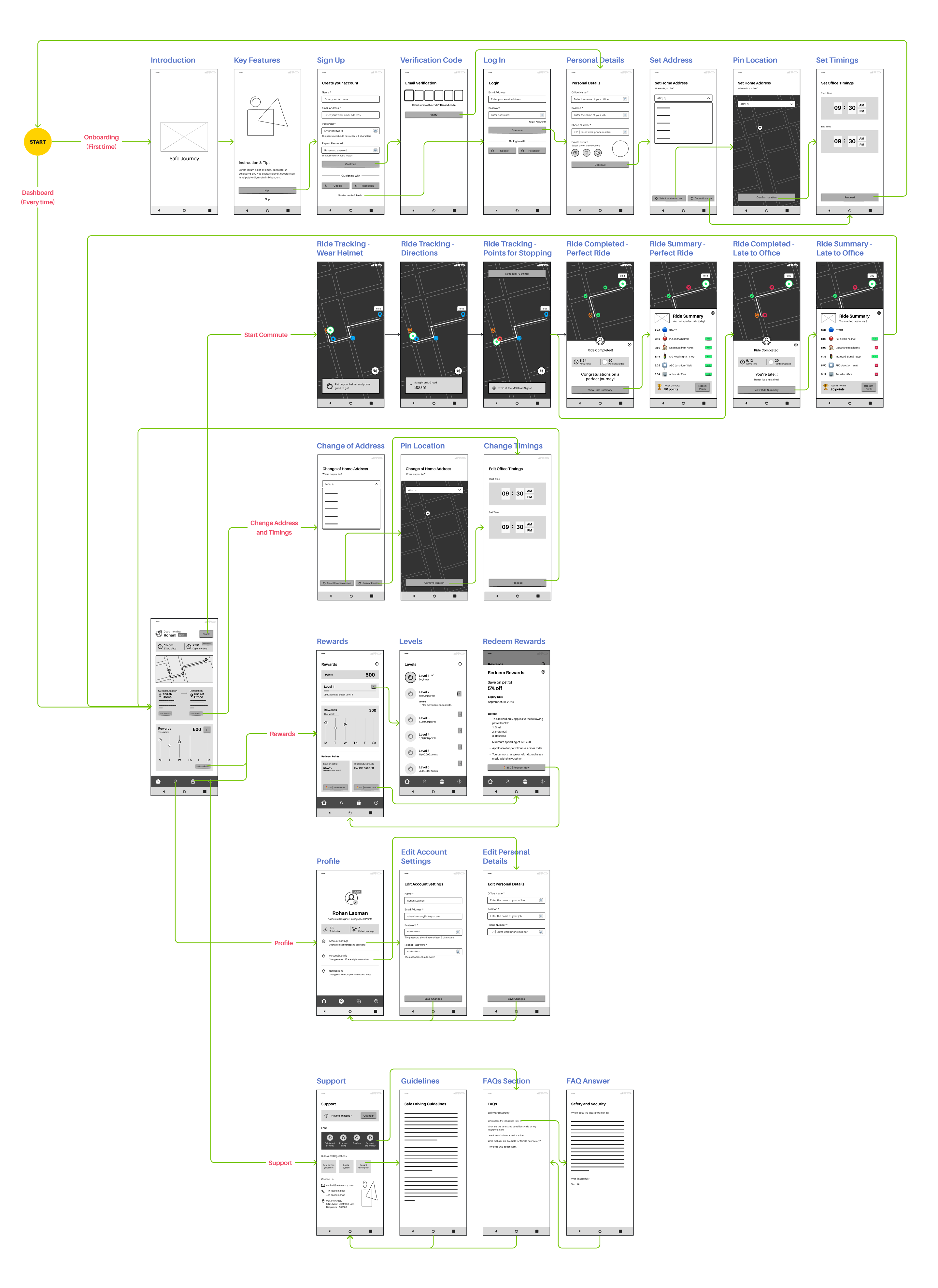
Wireframes & User Flow
Users set up their daily commute details, receive reminders to wear a helmet, and earn points for safe driving. After each commute, users are awarded additional points and can check their progress towards redeeming rewards. The app also provides profile management options and support features for any assistance needed.
Visual Design
A combination of blue and white, with green and yellow accents, has been implemented to reflect safety and reliability. Visually appealing illustrations based on the chosen color scheme have been utilized to create engaging screen layouts. The sans-serif font "Aileron" has been used to elevate the aesthetic appeal, by ensuring that the text is well-organized and easy to read. The layouts and spacing are consistent to create a sense of balance and clarity.
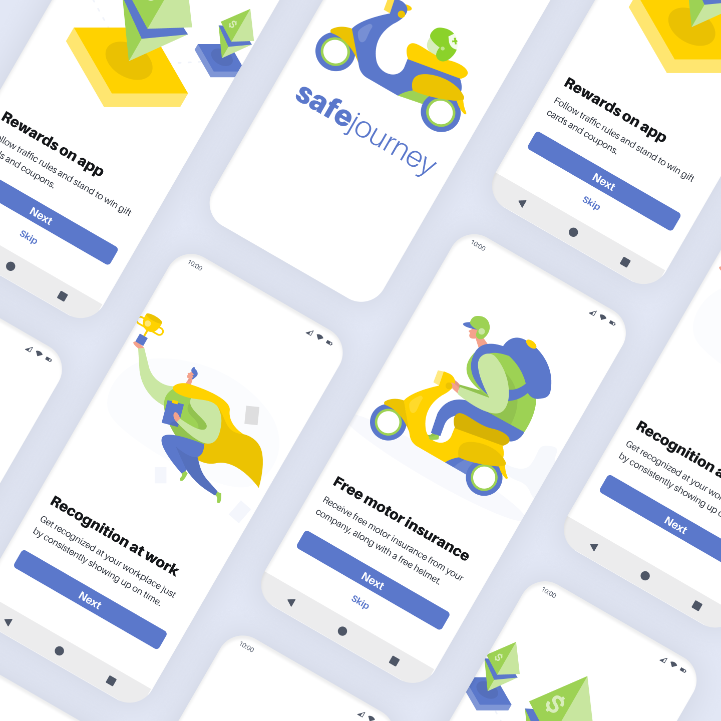
1. Onboarding
The onboarding screens highlight the benefits of using the Safe Journey app to the new user.
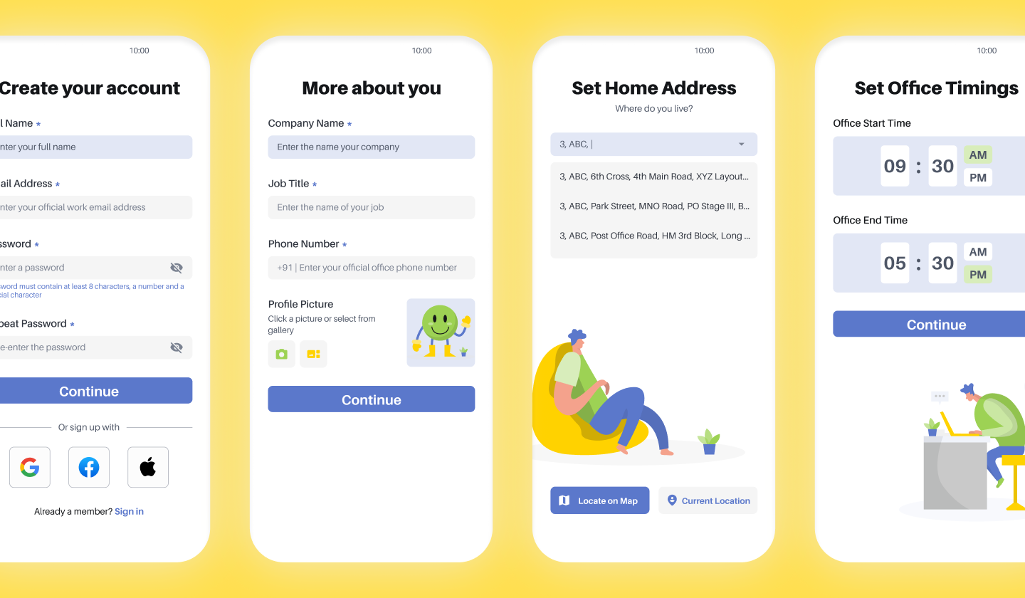
2. Set Up
Followed by the onboarding, the user needs to register by providing personal and professional details. Once an account is created, the user will save the locations of his home and office, and set the office timings.
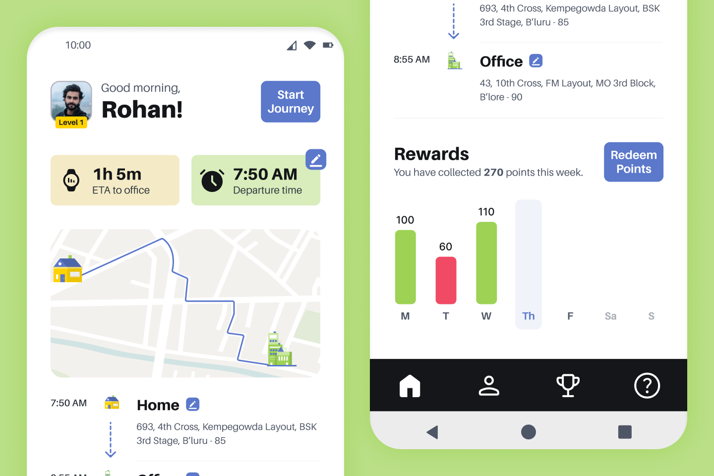
3. Dashboard
The dashboard is the home page of the app where the user can view details such as, the estimated duration of the office journey, the suggested time of departure to avoid a time crunch and a summary of points earned in the current week. This page also contains the "Start Journey" button, which the user hits when he's ready to leave.
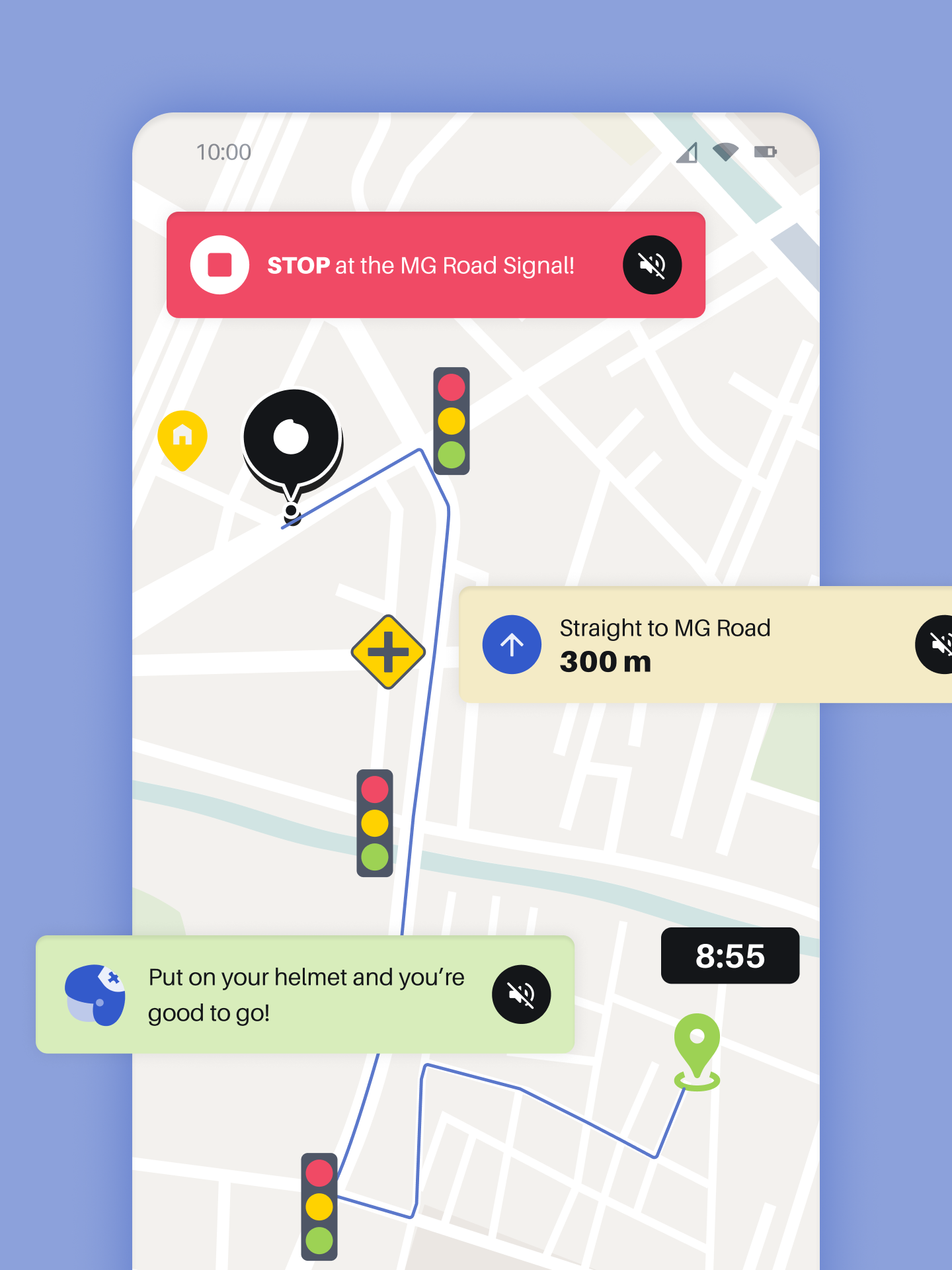
4. Ride-Tracking
This page displays the route to office, the estimated time of arrival and real-time data about the status of traffic signals and junctions. During this phase, the app provides voice notifications such as helmet reminders, directions and start/stop instructions from traffic signals.
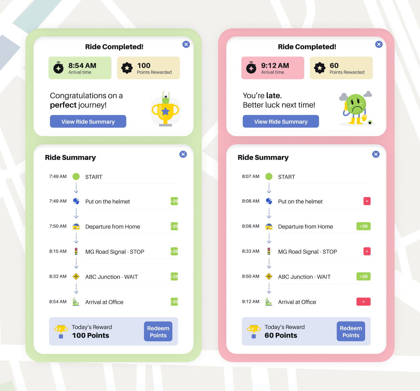
5. Ride Summary
Upon completion of the journey, the app provides details such as the actual time of arrival, points earned during commute and a comprehensive report of points earned at every stage of the journey. If the user was punctual and followed every traffic regulation along the way, then he is congratulated for a perfect ride. If he was late to work, then the mission is considered as a fail on that particular day.
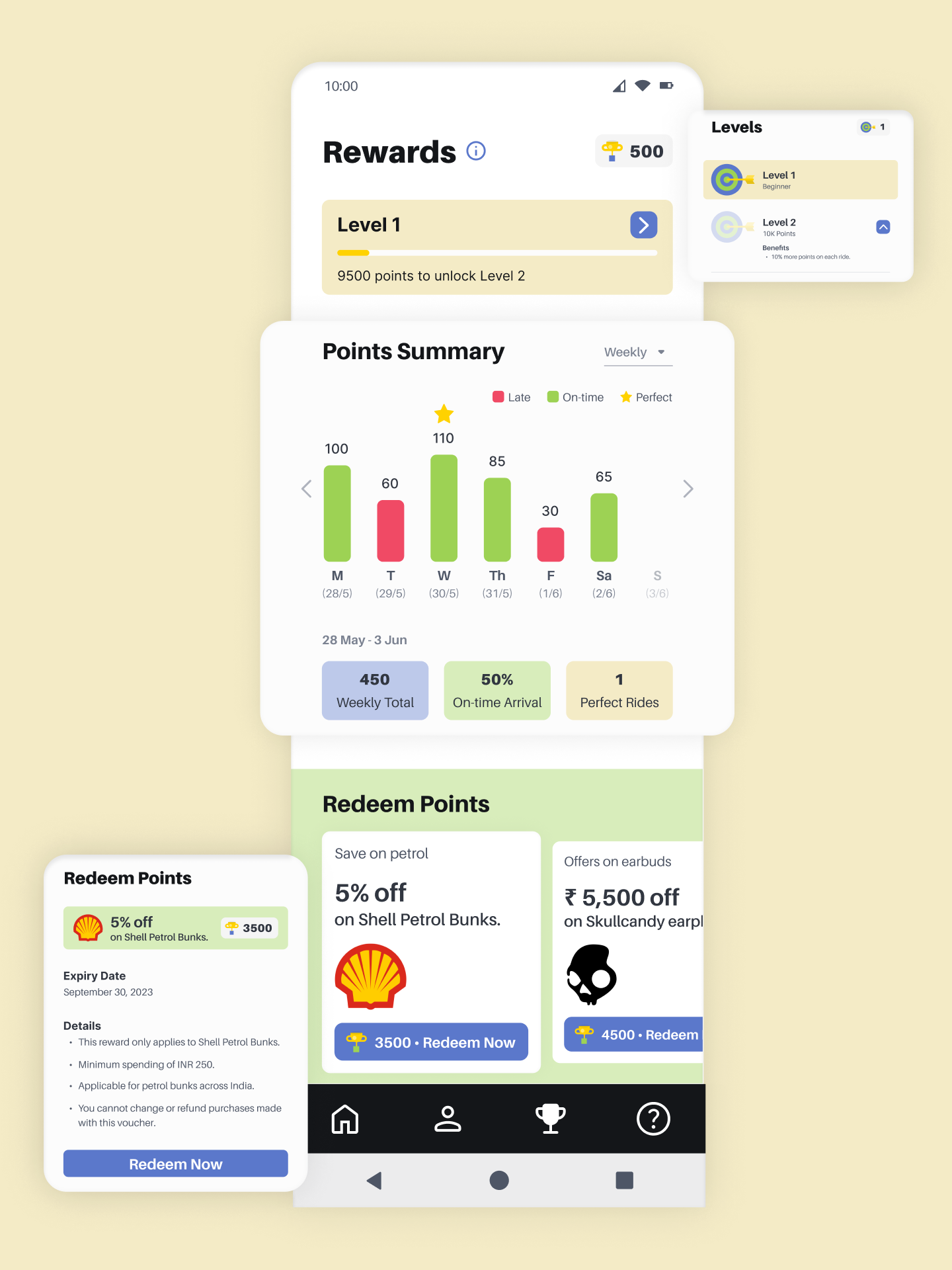
6. Rewards and Redemption
Here, the user can find his current level (which increases when milestone points are earned). The Points Summary section allows the user to select a time period (weekly / monthly / yearly) and find total points earned, number of successful arrivals and perfect rides. The user can also redeem points earned on incentives like petrol rate concessions.
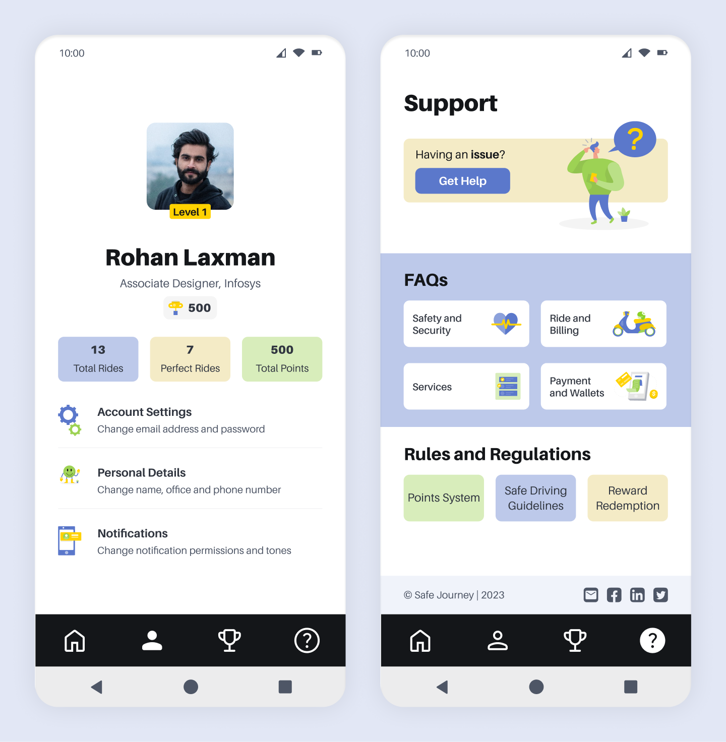
7. Profile and Support
On the Profile page, the user can view his details, a summary of his records and settings for accounts and notifications. To submit complaints, understand app rules or find FAQs, the user can head to the Support page.
Future Steps
The following initiatives can be considered for the future.
Explore opportunities to expand the app's availability to a wider audience and additional geographical locations.
Continuously improve the app's functionality based on user feedback and emerging technologies.
Forge new partnerships with relevant stakeholders to diversify the rewards program and offer a broader range of benefits.
Collaborate with government agencies, NGOs, and educational institutions to raise awareness about road safety and responsible riding practices.
I am actively looking for UX research and design opportunities! You can reach out to me at preeti.bengaluru@gmail.com


© All rights reserved – Preeti Vijayakumar