BentleySafe | Design Researcher (in a Team of 4)
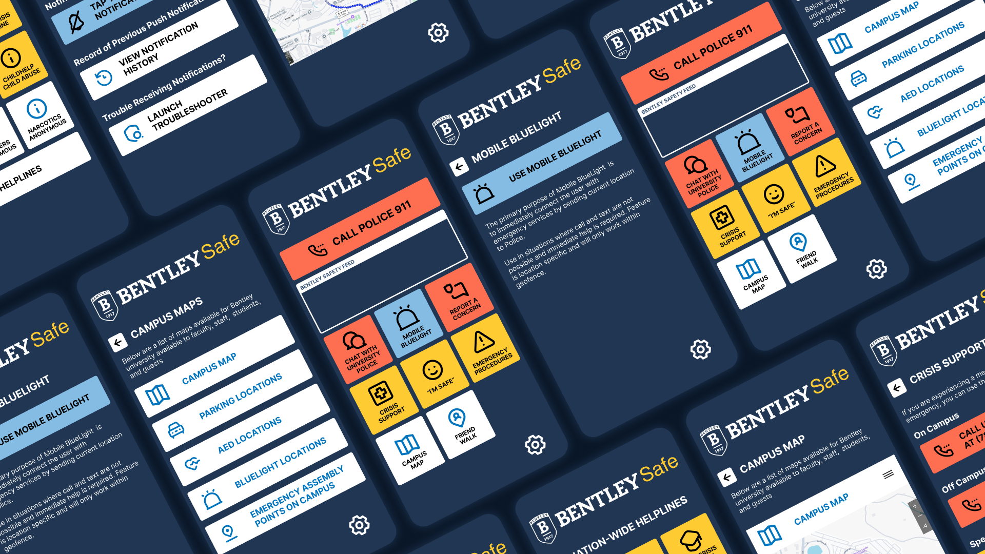
Through usability testing and iterative redesign, we uncovered critical usability gaps in the BentleySafe app and reimagined its interface to better support users in high-stress scenarios. This end-to-end project strengthened my skills across research, analysis, and design, bringing clarity, calm, and confidence to campus safety.
Tools:
FigJam, Figma, Miro, Google Sheets, Figma Slides, Jira
Summary
Project goal
Evaluating the usability of the BentleySafe App would help improve its intuitiveness, relevance, and perceived value for students and faculty.
Key Objectives:
Understand how users interact with key safety features.
Explore how different user groups (students vs. faculty) perceive and utilize the app.
Identify usability pain points and barriers to effective use.
Gather actionable insights to inform a more inclusive, user-centered redesign.
SWOT Analysis
To get started, we conducted a quick collaborative SWOT analysis on FigJam. This helped us assess the app’s internal capabilities and external landscape, ensuring that our design decisions were both user-centered and context-aware.
Strengths
Weaknesses
Opportunities
Threats
Competitive Analysis
To uncover opportunities and set a high design bar, we analyzed three peer apps—Google Safety, bSafe, and the University of Oregon app. This helped us evaluate BentleySafe’s strengths and gaps in real-world context, especially around usability, accessibility, and emergency communication.
USABILITY TESTING
We ran usability tests to evaluate how well BentleySafe supports students during high-pressure situations, uncovering gaps in clarity, flow, and task completion speed. We defined 5 main tasks to test users:
Task 1
View campus map
Task 2
Get help for a medical emergency
Task 3
Let a contact know you’re okay in an emergency
Task 4
Ask a contact to track you as you walk
Task 5
Modify notification preferences
What We Did:
Participant Profiles
We recruited 6 participants from the Bentley community through convenience sampling. While we achieved a balanced gender split (3 male, 3 female) and a mix of faculty (3), undergraduates (2), and graduate students (1), the sample skewed heavily toward international users (5 out of 6).
Given the short turnaround time for the project and the timing clashing with students' end-of-semester exams, this was the best that we could do; had we had more time, we would've tried to recruit more participants with an even distribution across demographics.
Data Synthesis and Analysis
From raw feedback to clear direction using Miro and Google Sheets
After conducting usability testing, we collected observations, user quotes, and ratings in Miro and visualized patterns in Google Sheets. This helped us cluster issues, spot trends, and prioritize design changes that would make the greatest impact.
Overall Test Ratings
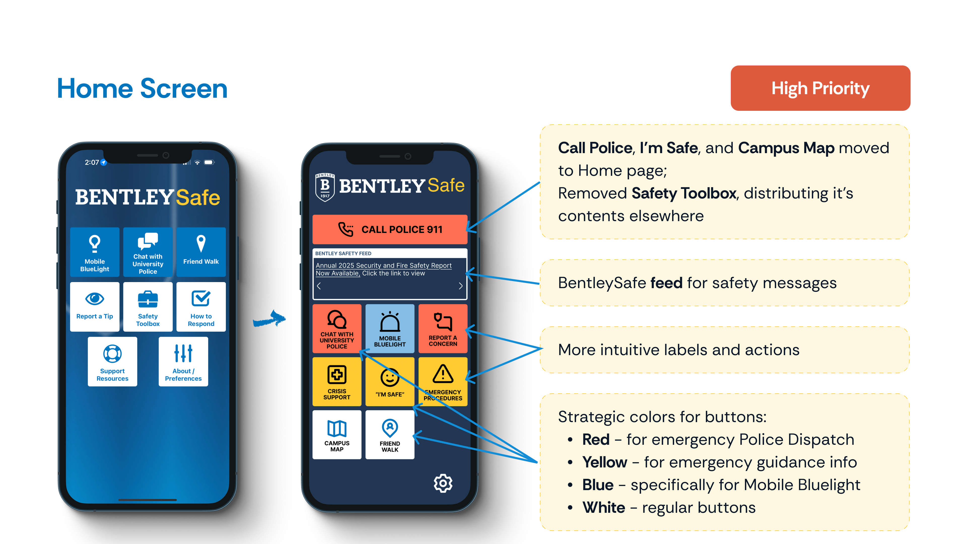
Users took the longest to locate the Campus Map, I’m Okay, and Medical Emergency Help features, largely because they were buried under buttons with unclear or unintuitive labels. In contrast, the Friend Walk and Notification Preferences were more easily found, thanks to stronger alignment between user mental models and the app’s feature placement.
Redesigns
Each redesign directly reflects what users told us—and what they didn’t. Based on the insights above, we reimagined key flows to reduce cognitive load and improve access to high-priority features. Dive into each redesign by clicking on the thumbnail to see what changed, why it mattered, and how it solved the real user frustrations we uncovered.
Marketing Strategies
Through research, we realized that redesign alone wouldn’t drive engagement. Many students weren’t even aware of the BentleySafe app—let alone critical features like Bluelights or AEDs. To bridge this gap, we proposed strategic awareness efforts to get the app on students’ radars and make its vocabulary part of campus culture.
Orientation Integration
Educational Support
Empowering Internal Support
Celebrate and Communicate
Wrap Up
Our team concluded the project by presenting our findings and redesign recommendations to both the Bentley University Police Department and AppArmor, the third-party platform powering the app. Alongside the presentation, we delivered a comprehensive report documenting our research, usability testing, and redesign rationale to guide next steps in the app’s development.
WIN
Hands-on ownership across the product lifecycle
I led end-to-end—from user research and testing to prototyping, synthesis, and final presentation. I also drove the creation of the report and was the primary contributor through most phases, while using agile methods to keep us moving.
LEARNING
High-stakes design needs low-friction usability
In emergency contexts, even small friction—unclear labels, buried features—can mean big consequences. Simplicity, visibility, and user vocabulary familiarity are critical.
WISH
More time + broader participant base
Conducting usability testing at the semester’s end made it hard to recruit undergrad participants. As a result, most testers were international students, which may have unintentionally skewed perceptions of certain emergency terms like “Bluelight” or “AED.”